Pacific Crest Bank is a Northwest local, independently-owned community bank delivering a high level of customer service and expertise to the community.
Client
Seagen
Year
2022
Services
Advertising
Brand Development
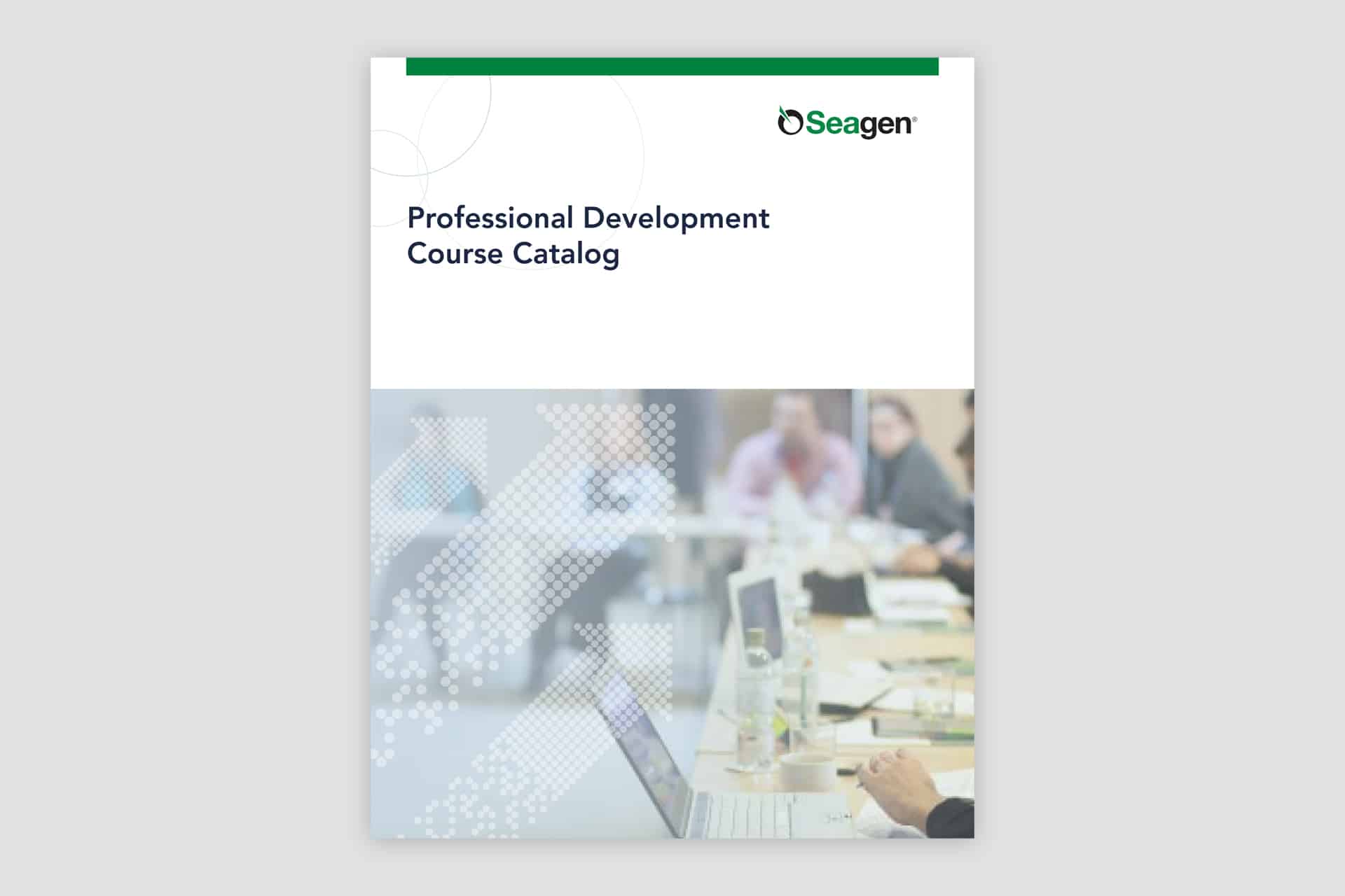
Brochure Design
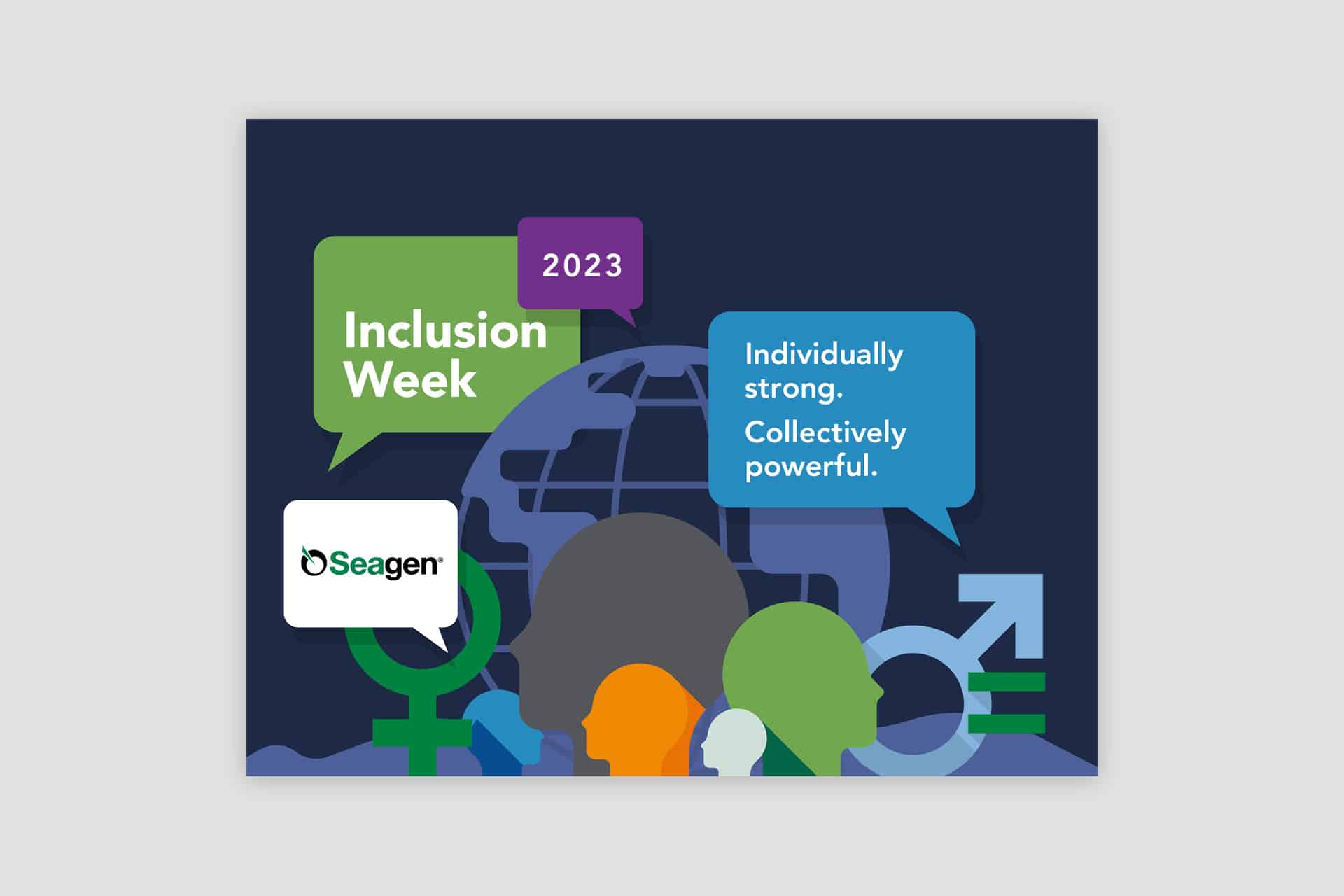
Event Posters
Logo Design
Supporting Marketing Collateral
Photography
PowerPoint Template
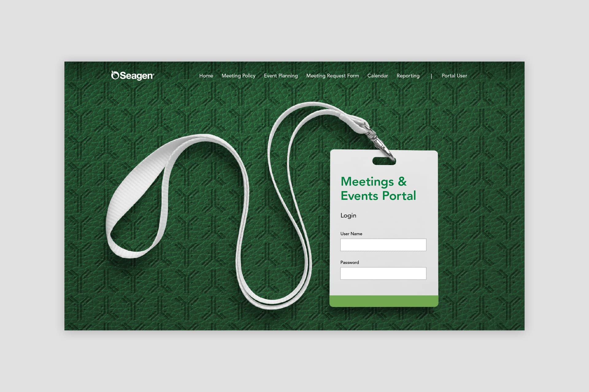
Website Design
Local roots. Exceptional service.
Founded in 1984, the organization has evolved over its history to offer Northwest businesses and individuals personalized banking and lending services from a dedicated team of long-tenured professionals. The company’s performance consistently earns the highest ratings from financial industry independent research firms.
Graphica has been working with Pacific Crest Bank since 2012. We started the relationship off with the refinement of an existing logo and a buildout of a new brand style. Since then, we have designed their website, created advertising and marketing materials, and photographed beneficiaries of their banking services.
Pantone® 532 C
C71 M65 Y64 K72
#232323
Pantone® 128 C
C3 M14 Y76 K0
#f9d55c
Pantone® 663 C
C02 M01 Y01 K00
#f7f7f7
Pantone® 663 C
C02 M01 Y01 K00
#f7f7f7
Research
We reviewed the internal usage of the name to see how prevalent the shortened name was being used. We also looked at the amount of materials that needed to be updated with the new logo.
Strategy
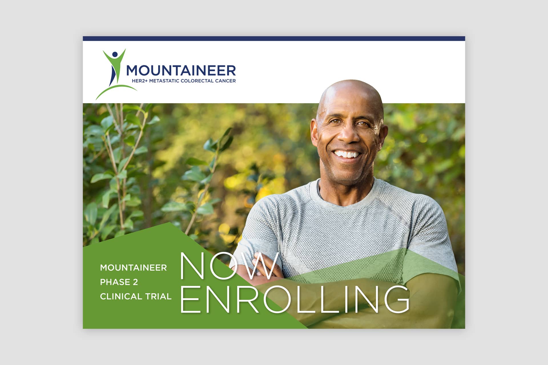
The company’s goal was to communicate its development process and scientific value to a variety of audiences: investors, partners, patients, medical professionals, scientists, regulators, and employees.
Creative Direction
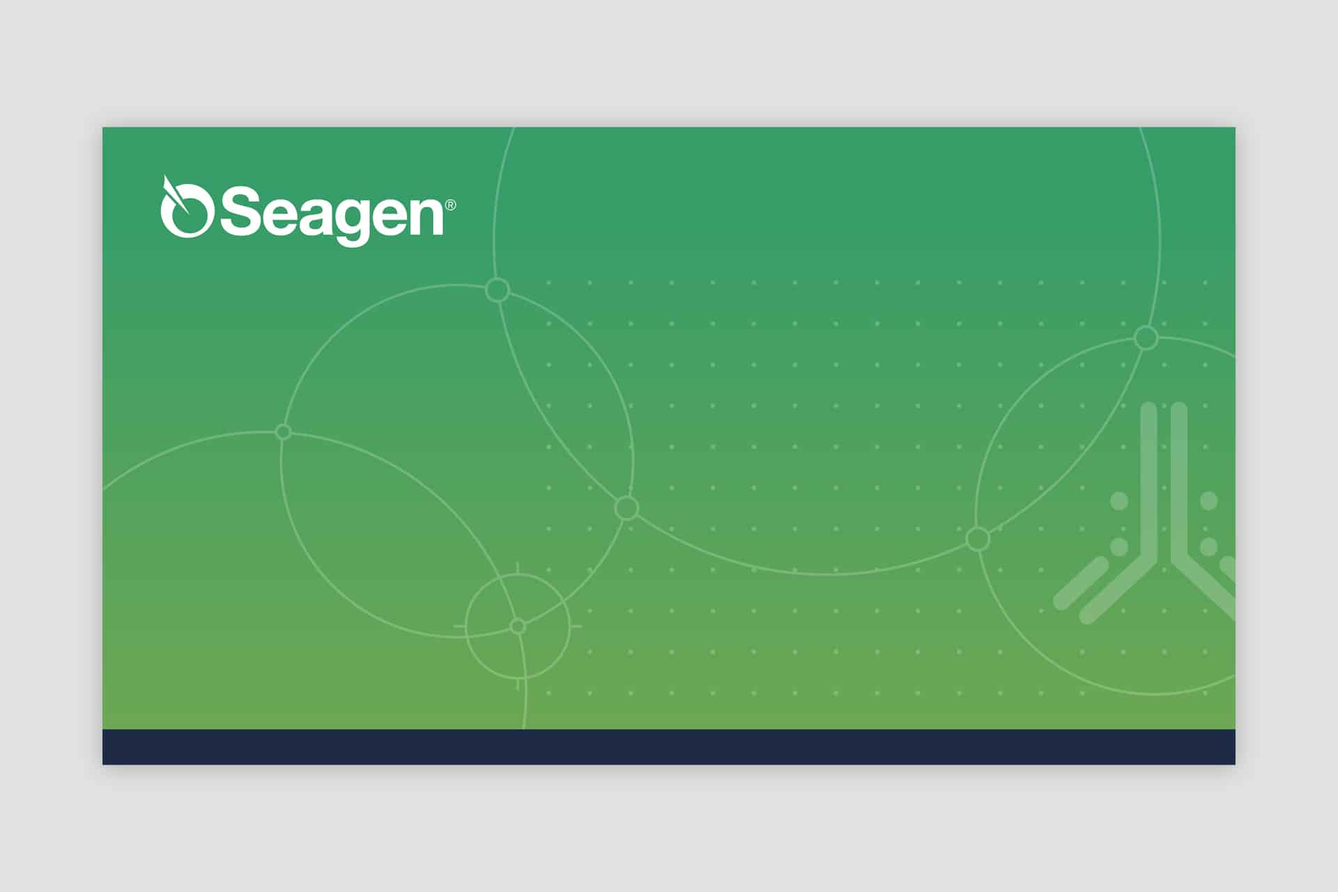
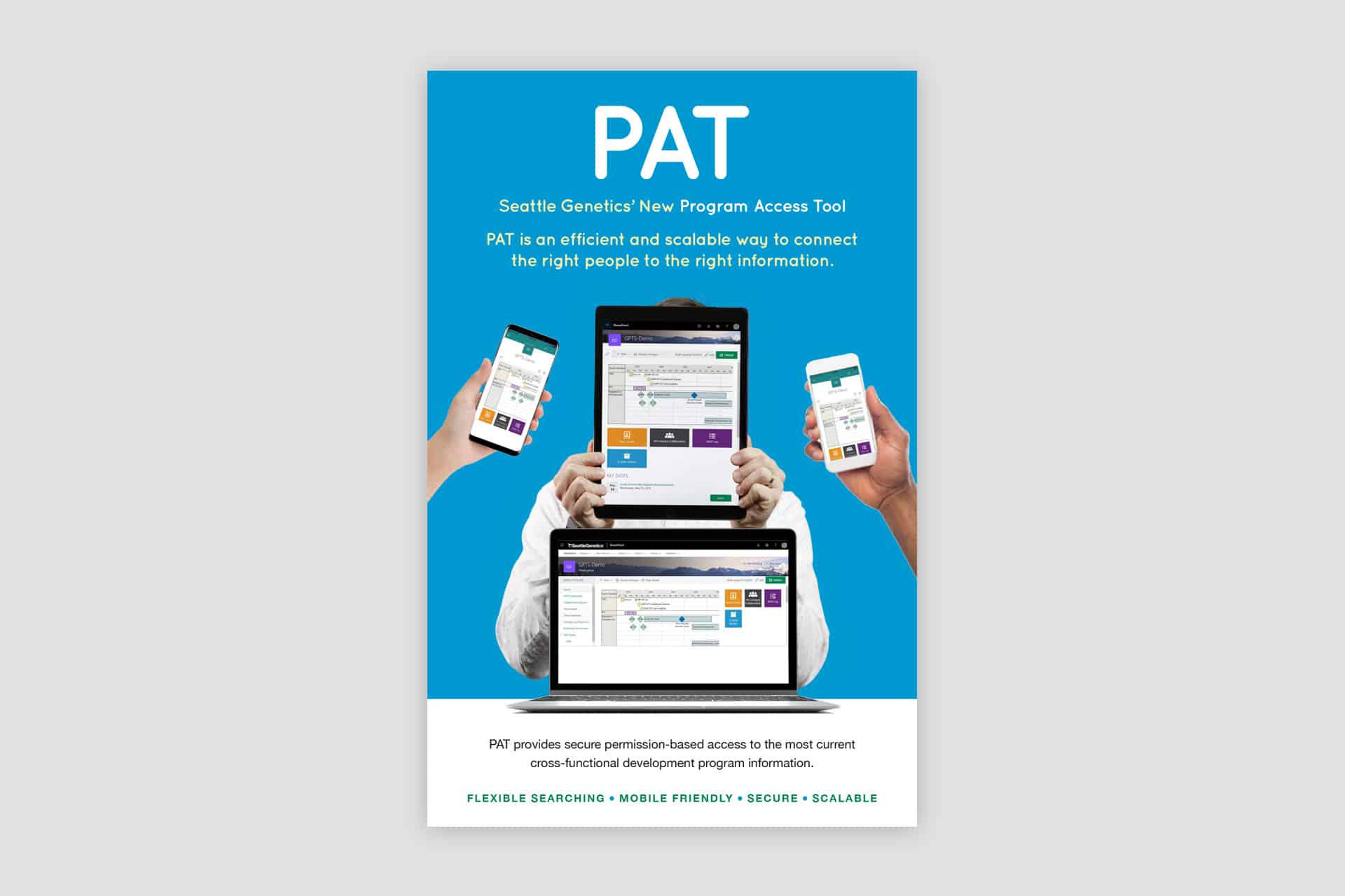
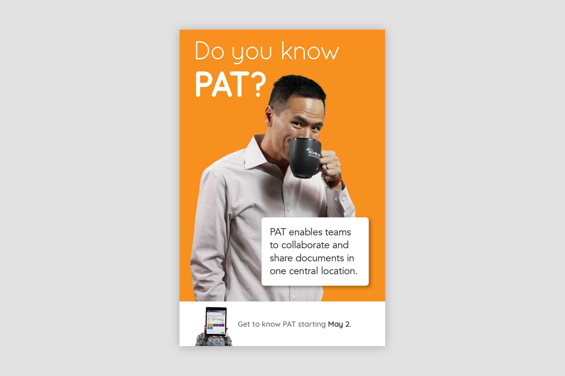
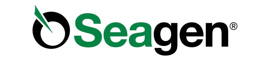
We built on Seagen’s existing brand equity to signal an evolution rather than a reinvention of the company. The core premise of the logo remained intact, while thoughtful refinements gave it greater presence and impact. Supporting brand elements were refined and expanded to create a more cohesive, consistent system that maintained flexibility across applications.
Design
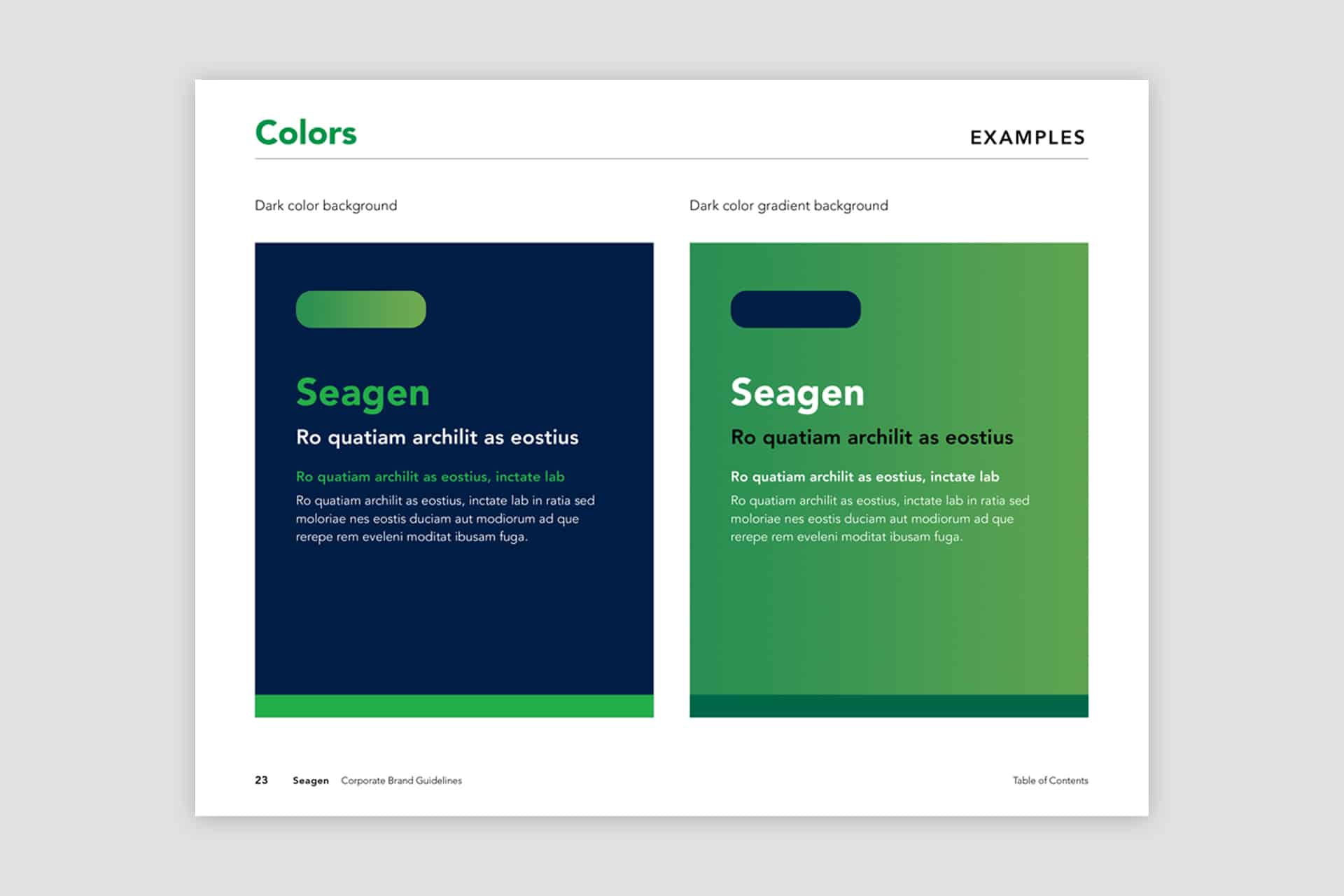
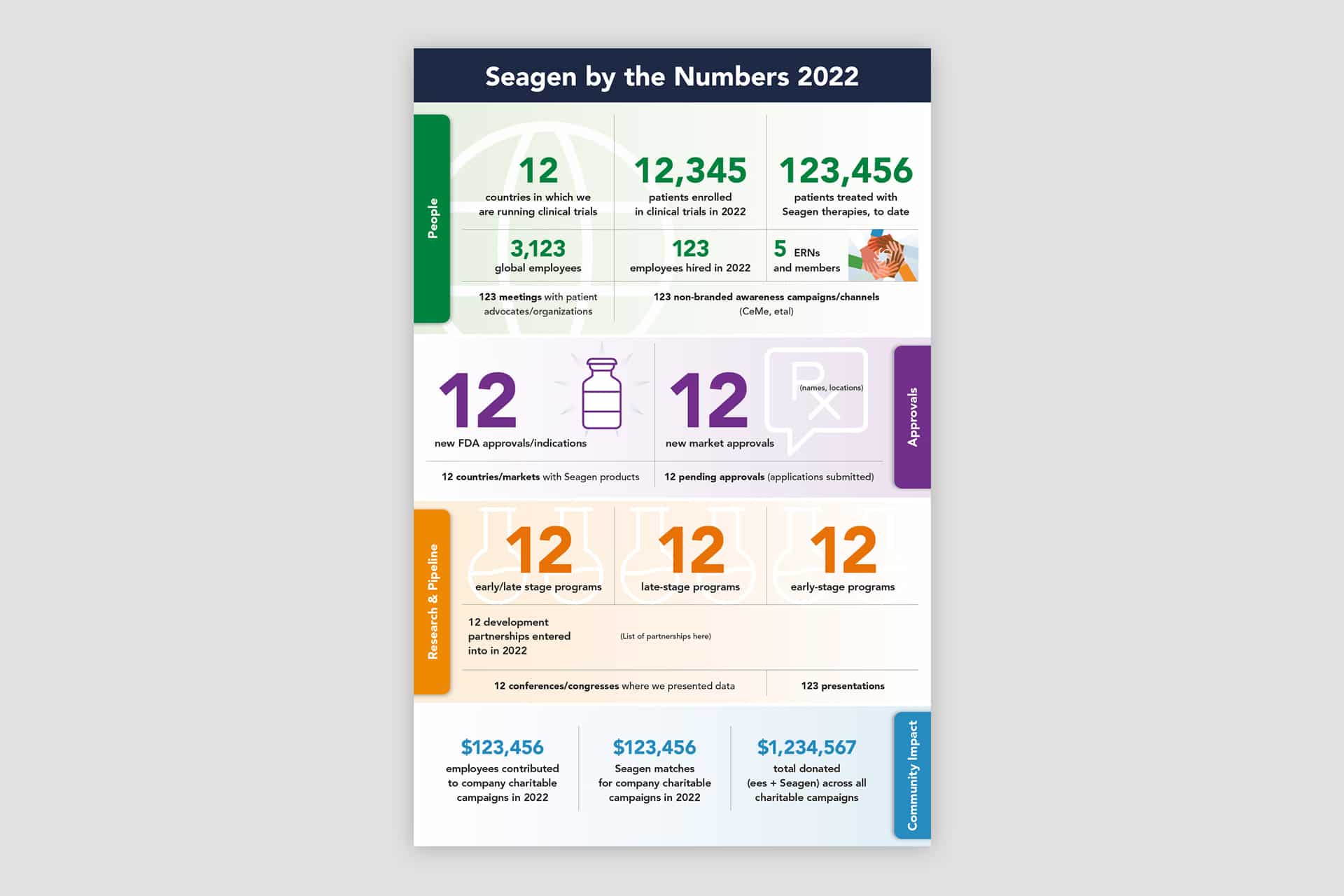
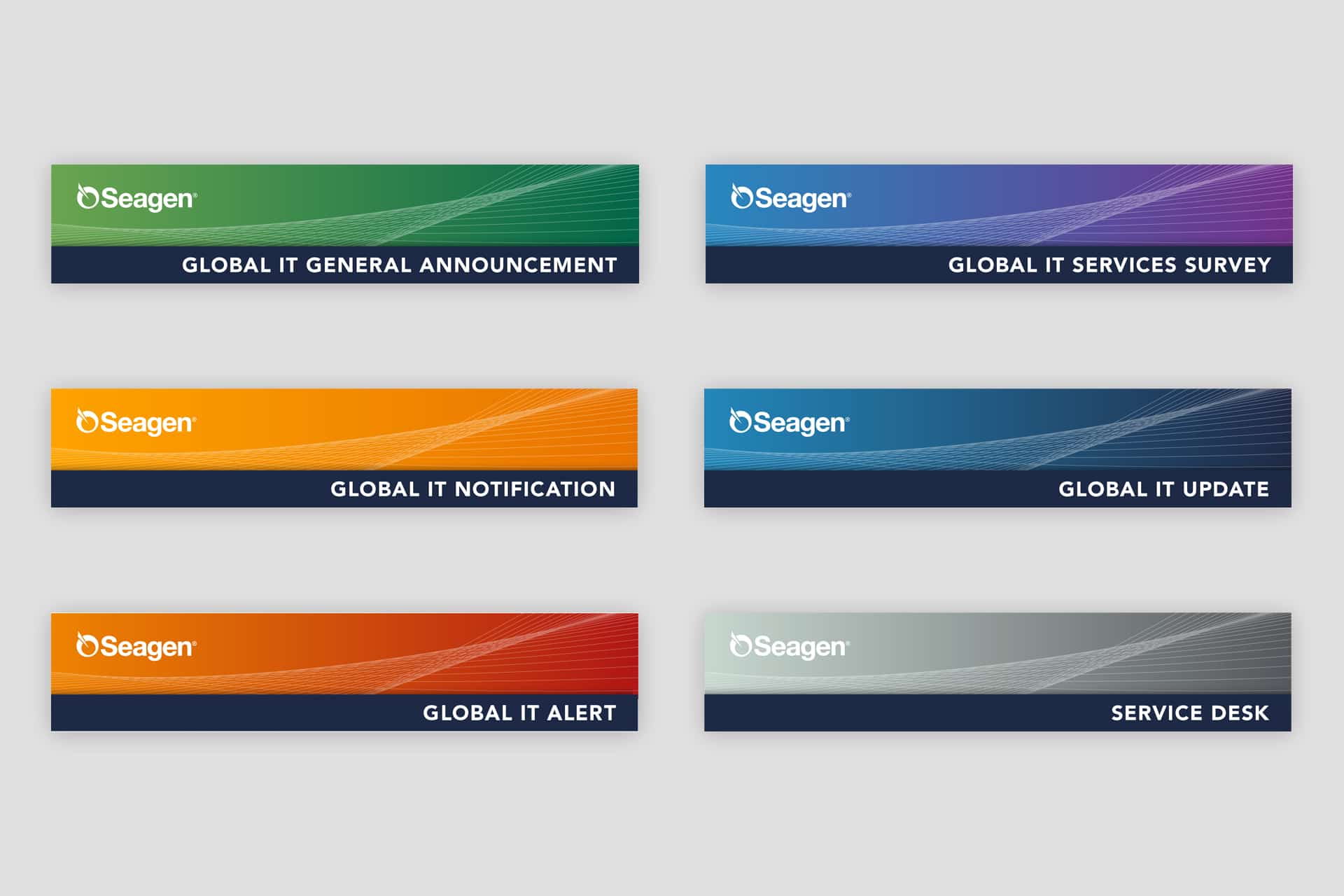
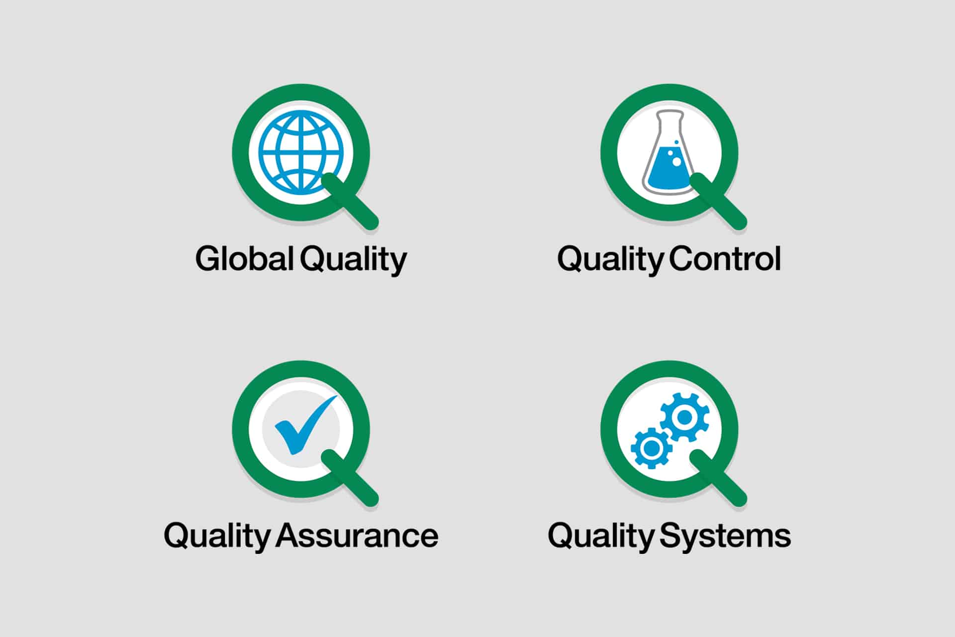
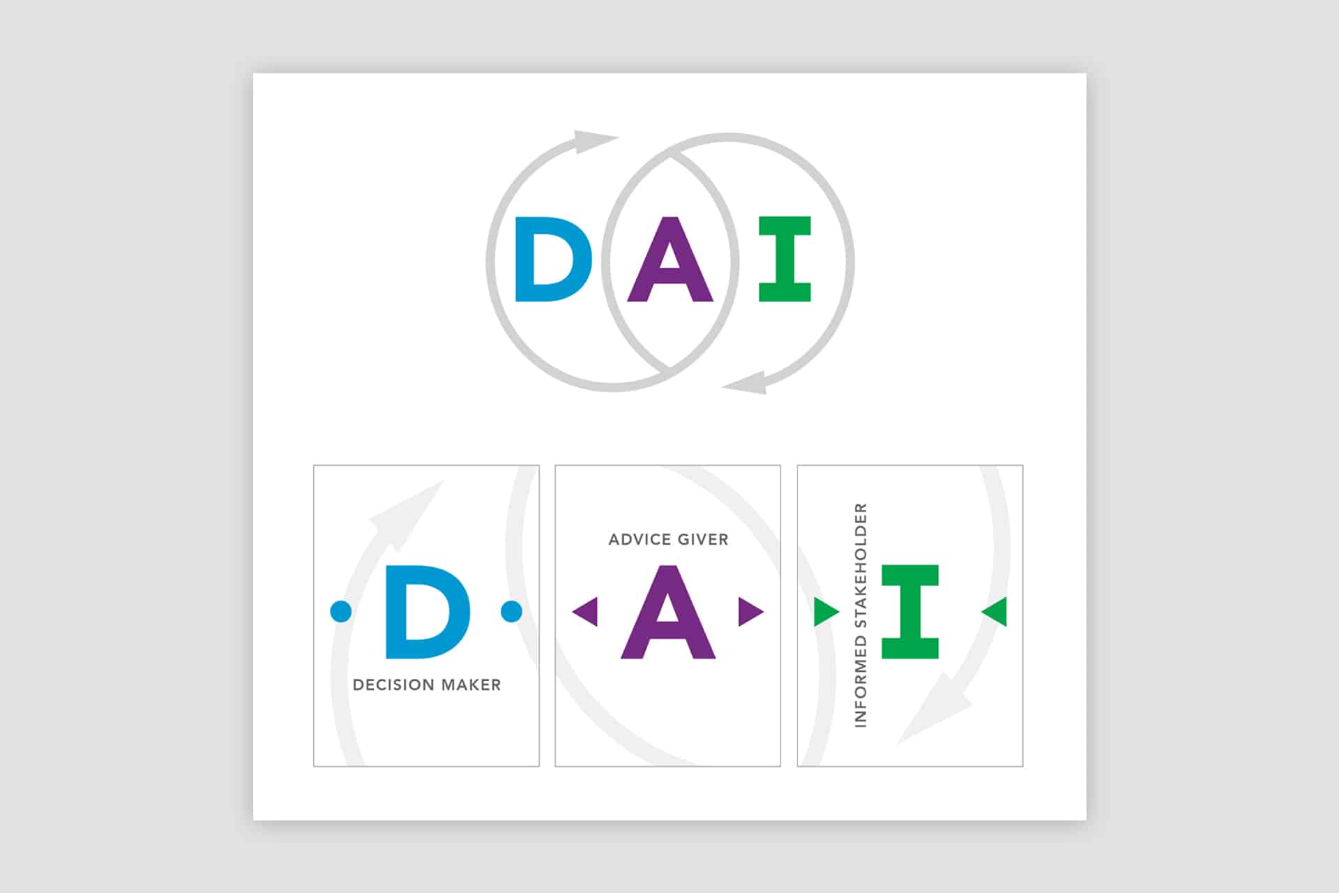
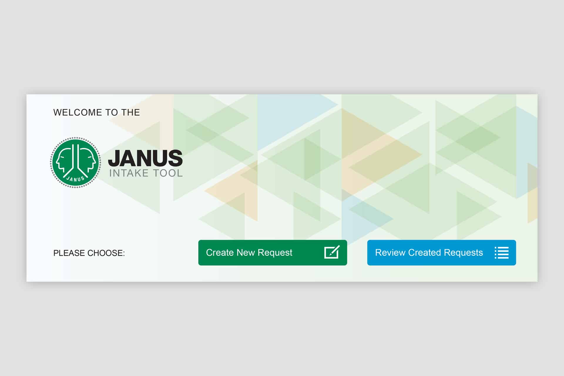
The design language was built around clear and concise communication. The type was crisp and approachable. The color palette was eye catching and flexible. The consistent structuring of the graphic elements created consistency throughout the organization. Supporting program and department logos were designed as a cohesive system.
Implementation
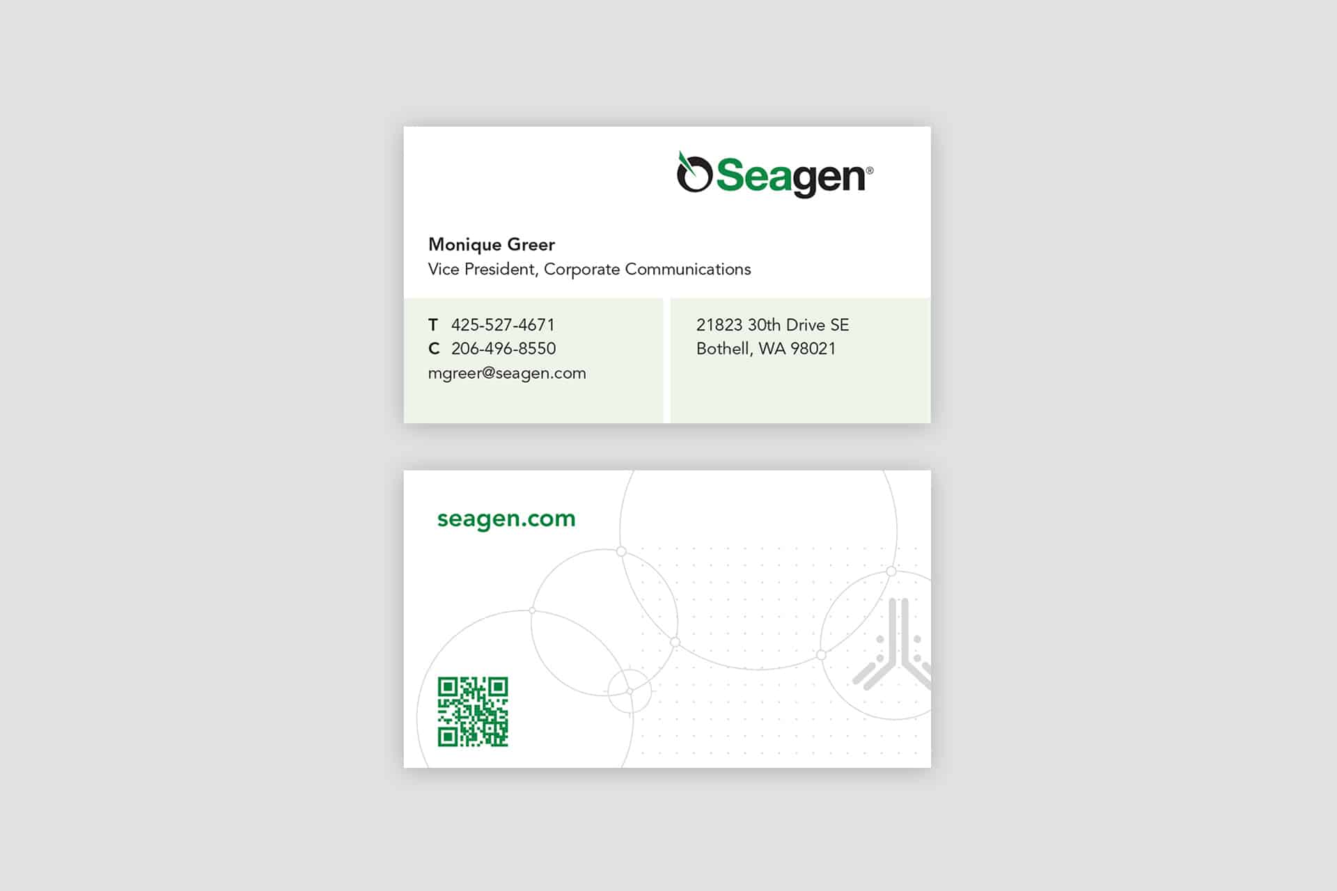
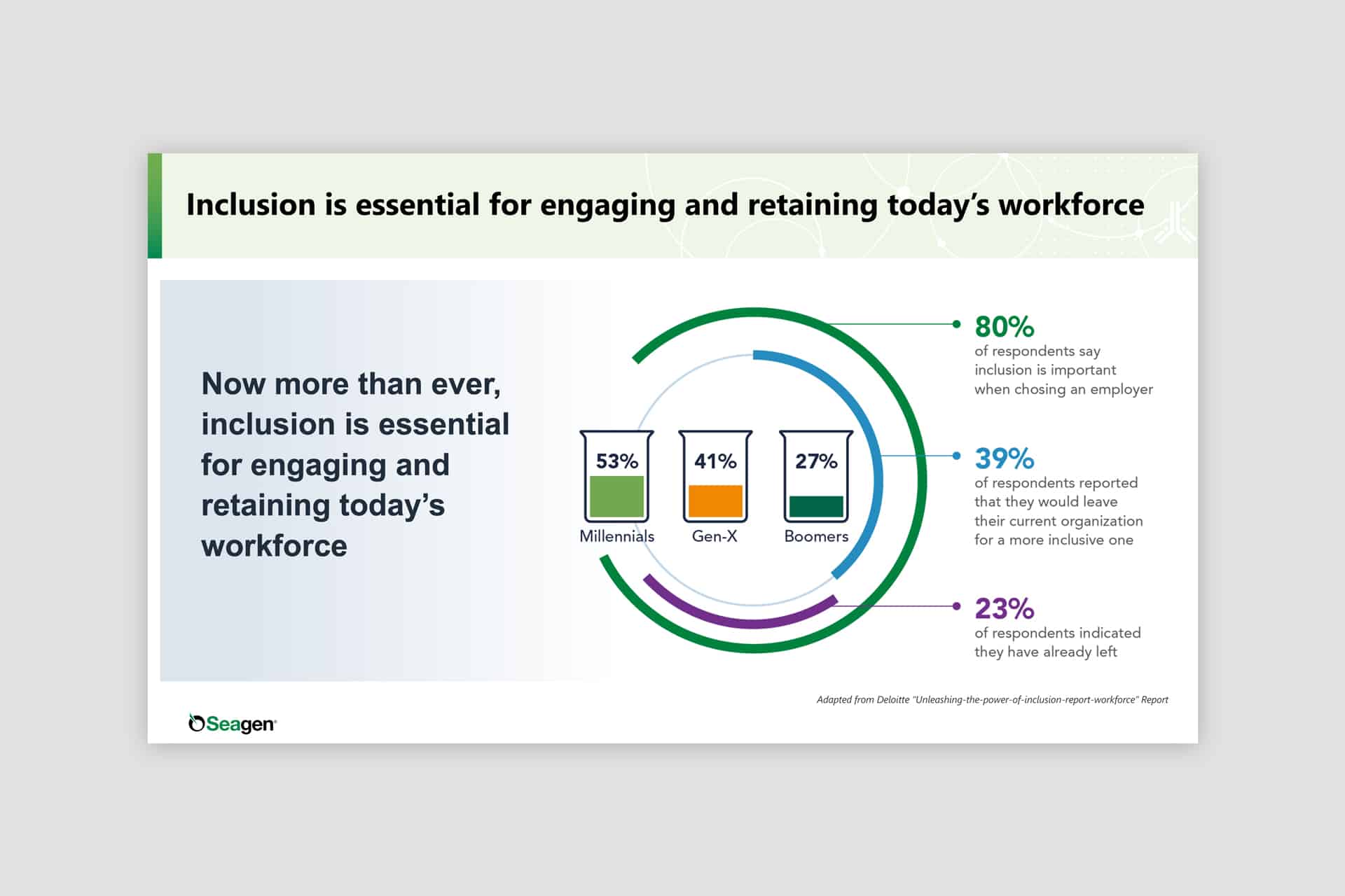
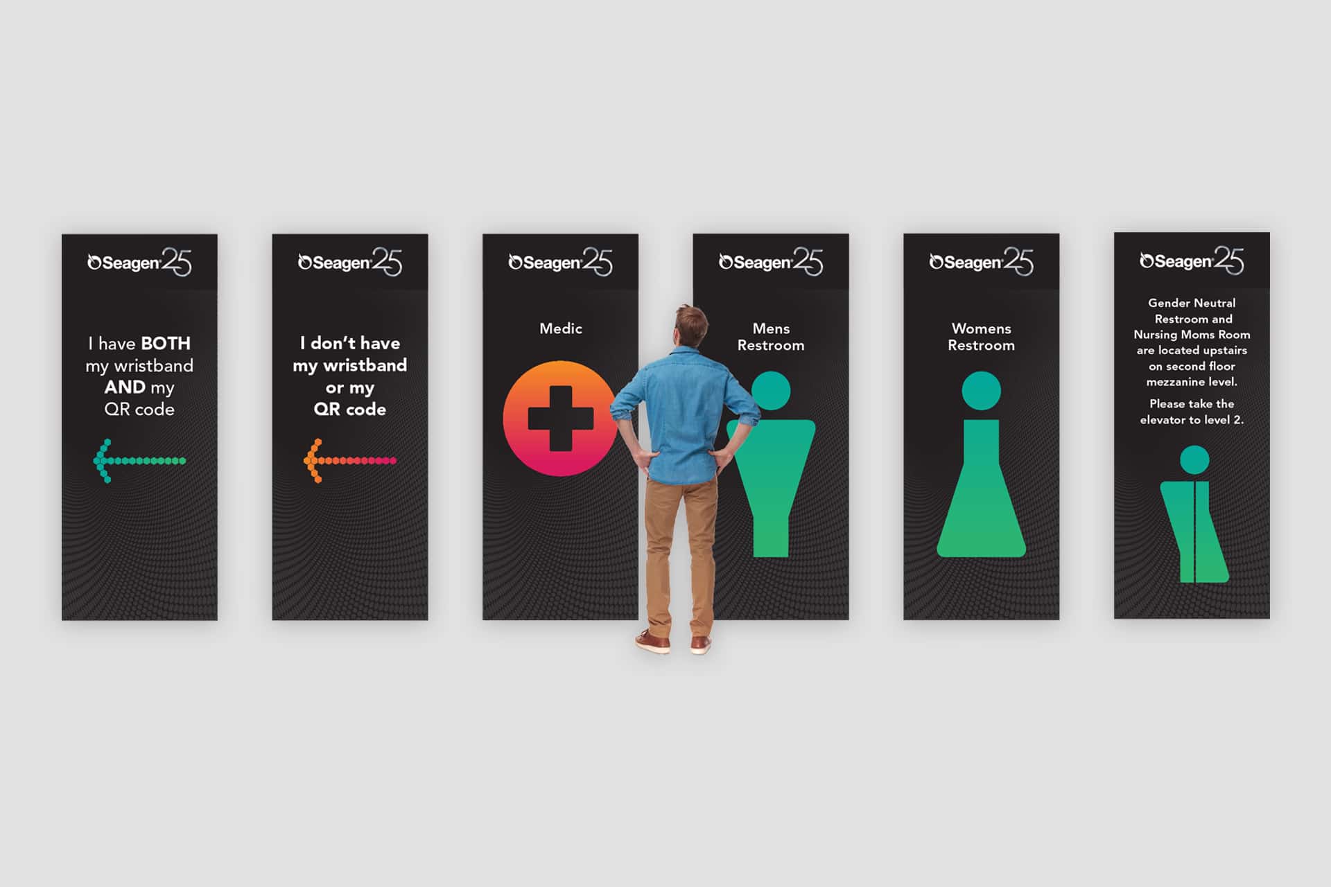
Due to the size of the company and number of departments, we decided to tackle the projects in phases. The most mission critical business communications were first — website, investor materials, business cards and email signatures, building signage, Zoom meeting backgrounds, and social media graphics. Changing to the new brand on the remaining items was addresses on an as needed basis.
Results
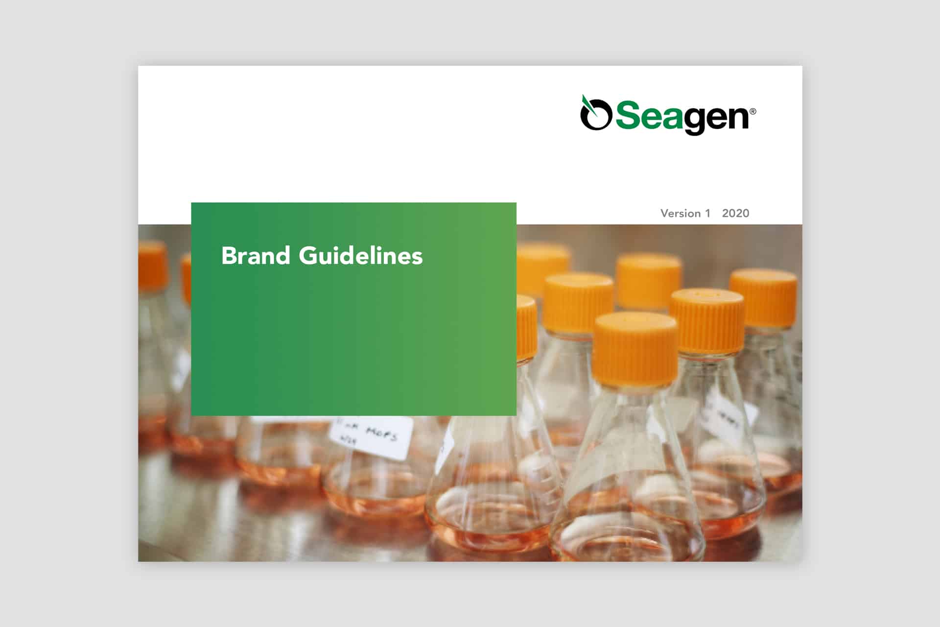
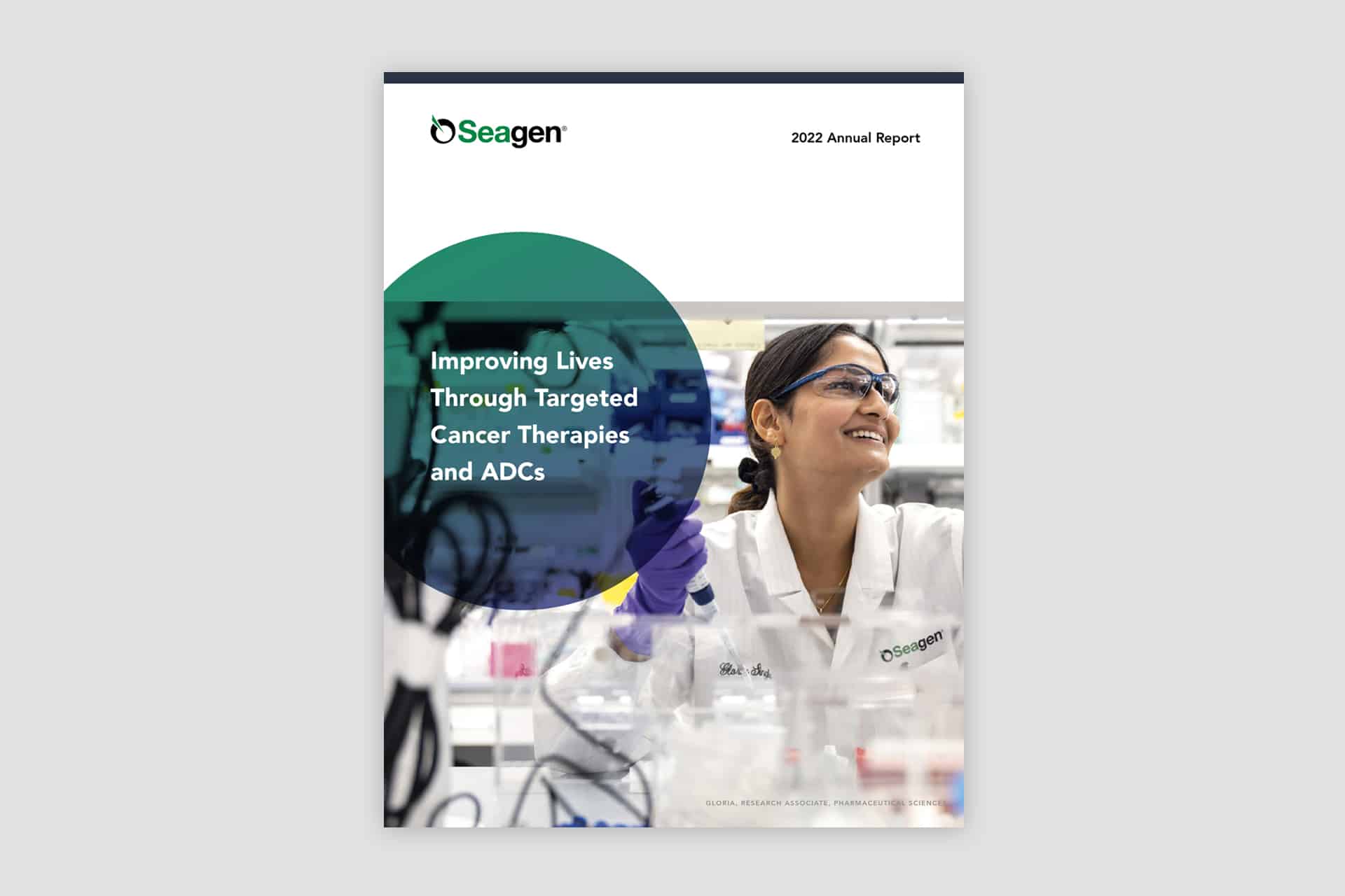
The brand evolution resulted in a cohesive and adaptable system designed to balance departmental differentiation with a unified brand experience. The refreshed identity brought a crisp, modern presence to Seagen, strengthening its distinction within the competitive landscape. Detailed brand guidelines empowered employees with practical tools and clear direction to create materials that maintained consistency while meeting the unique needs of their teams.
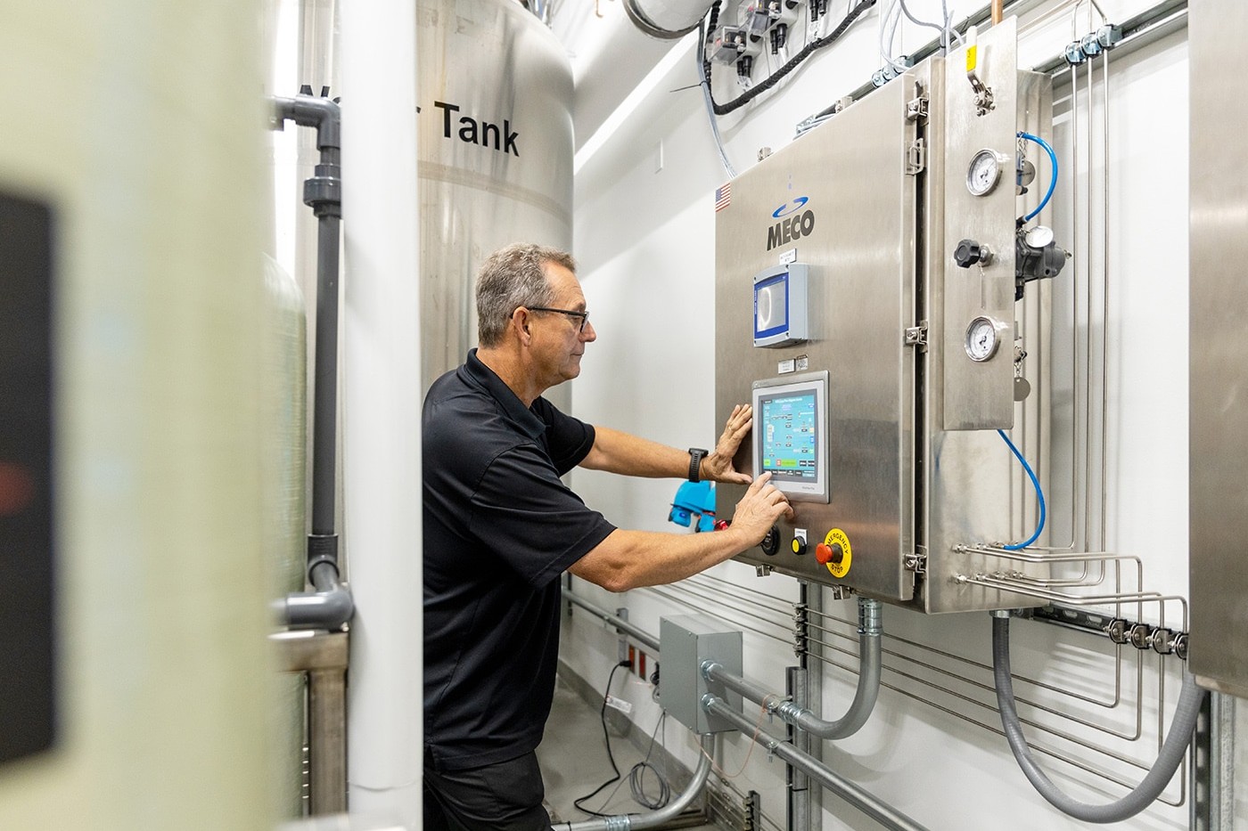
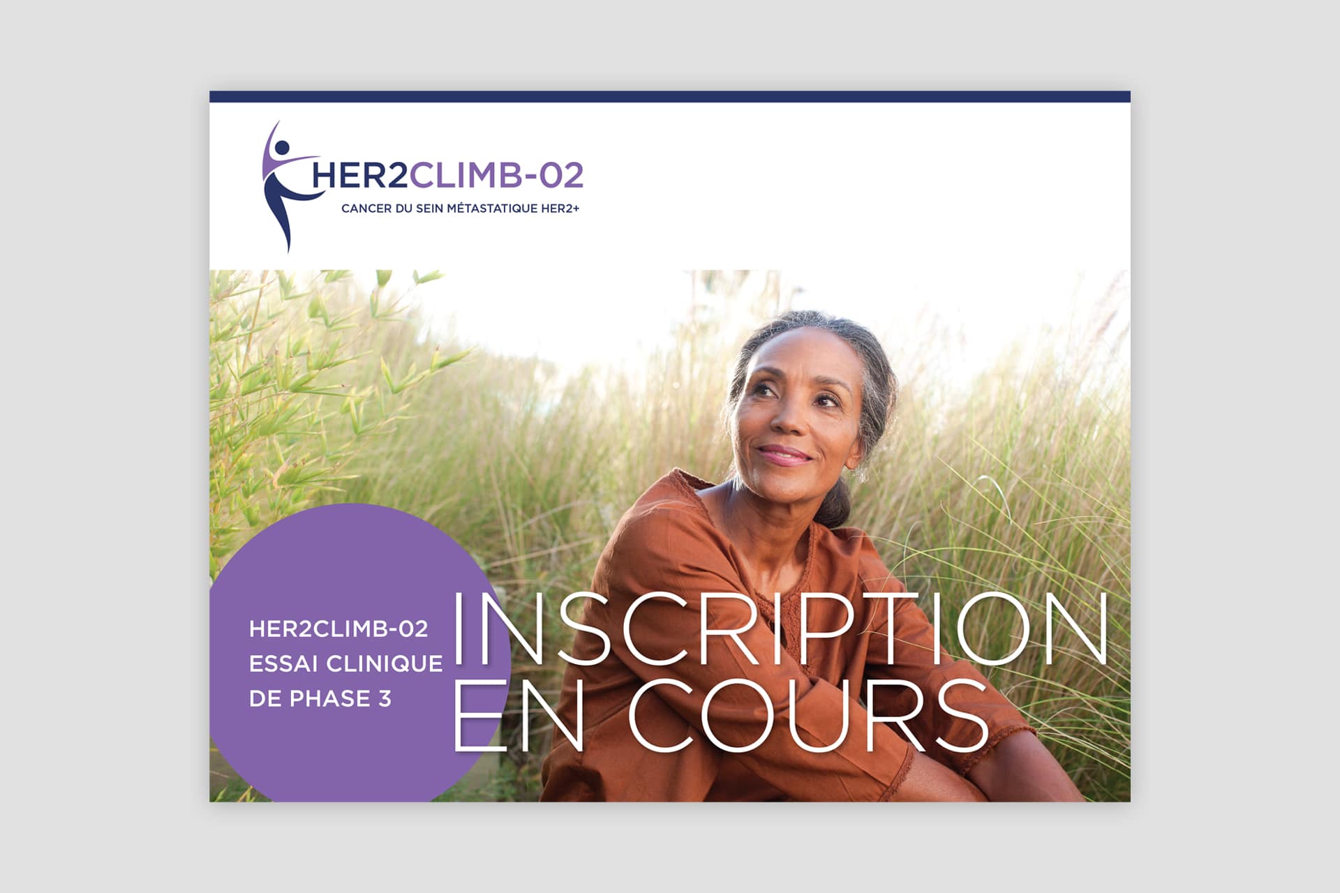
Custom photography
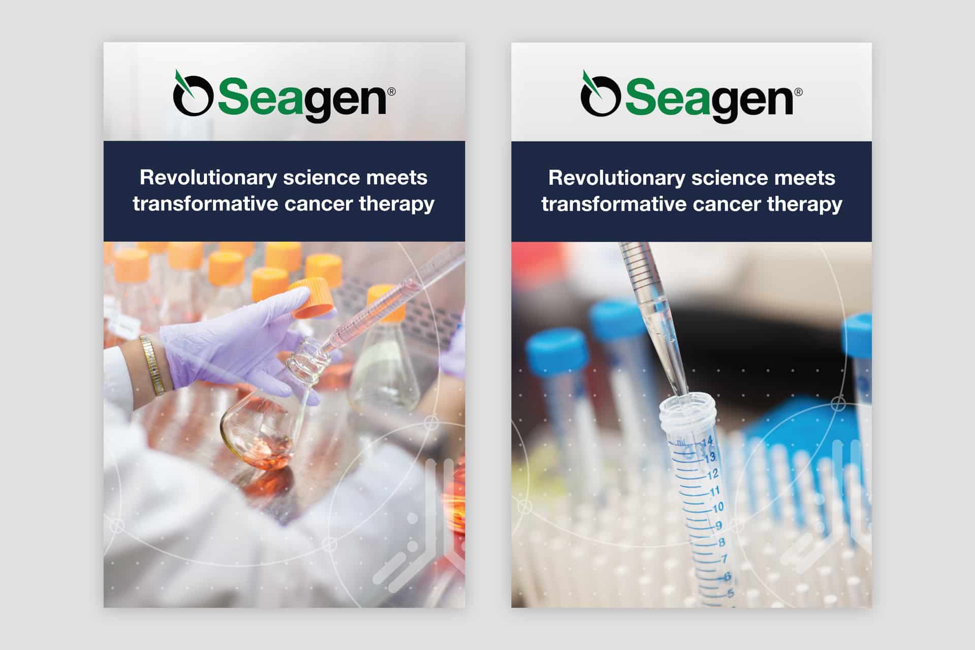
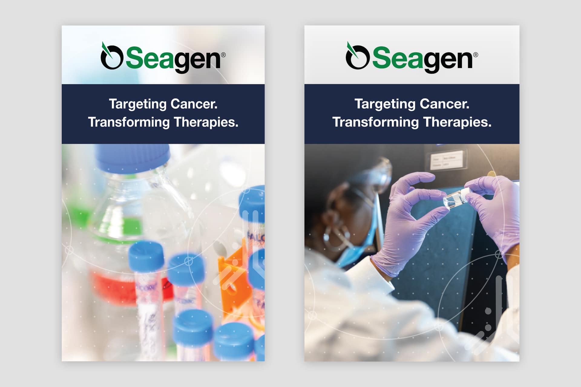
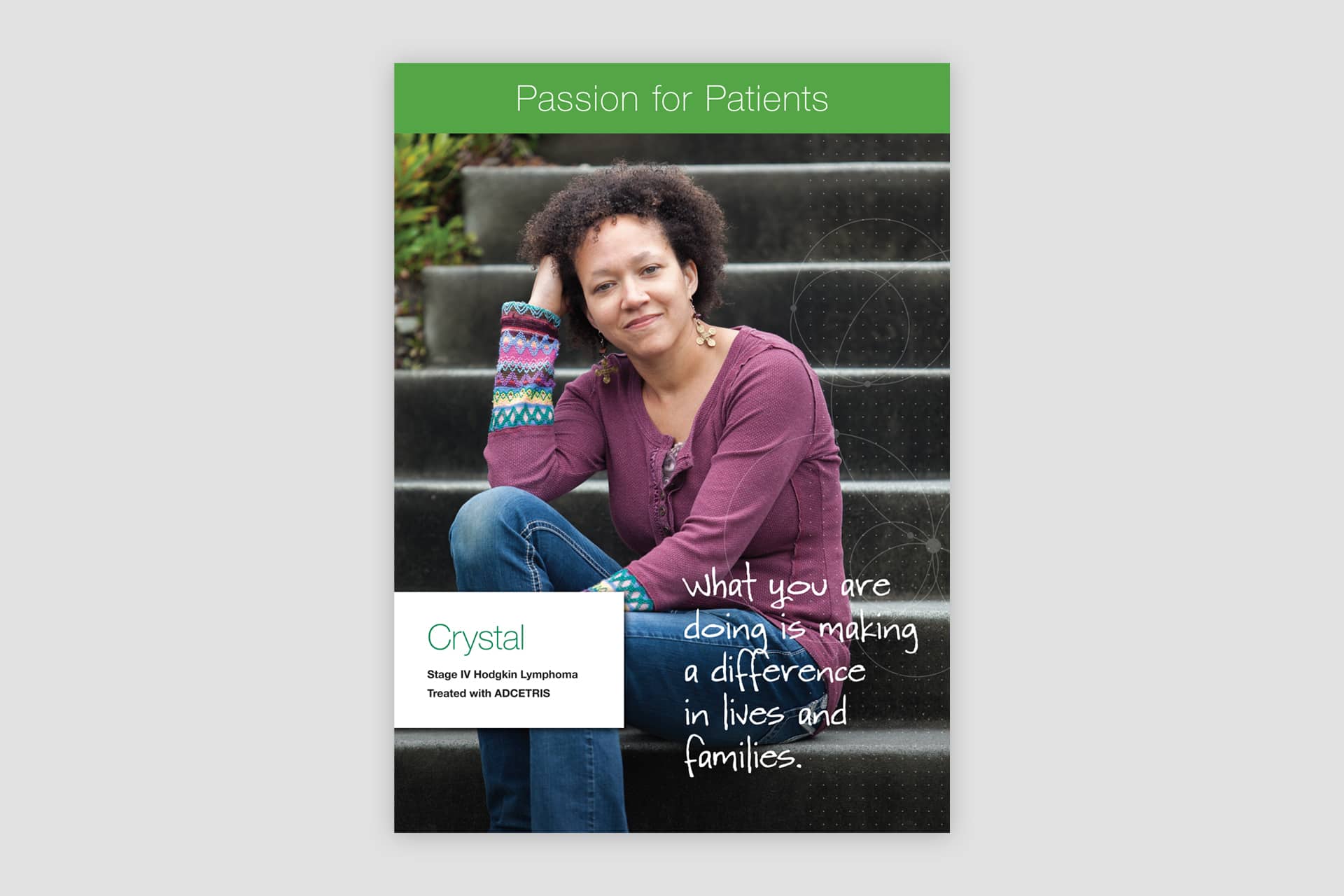
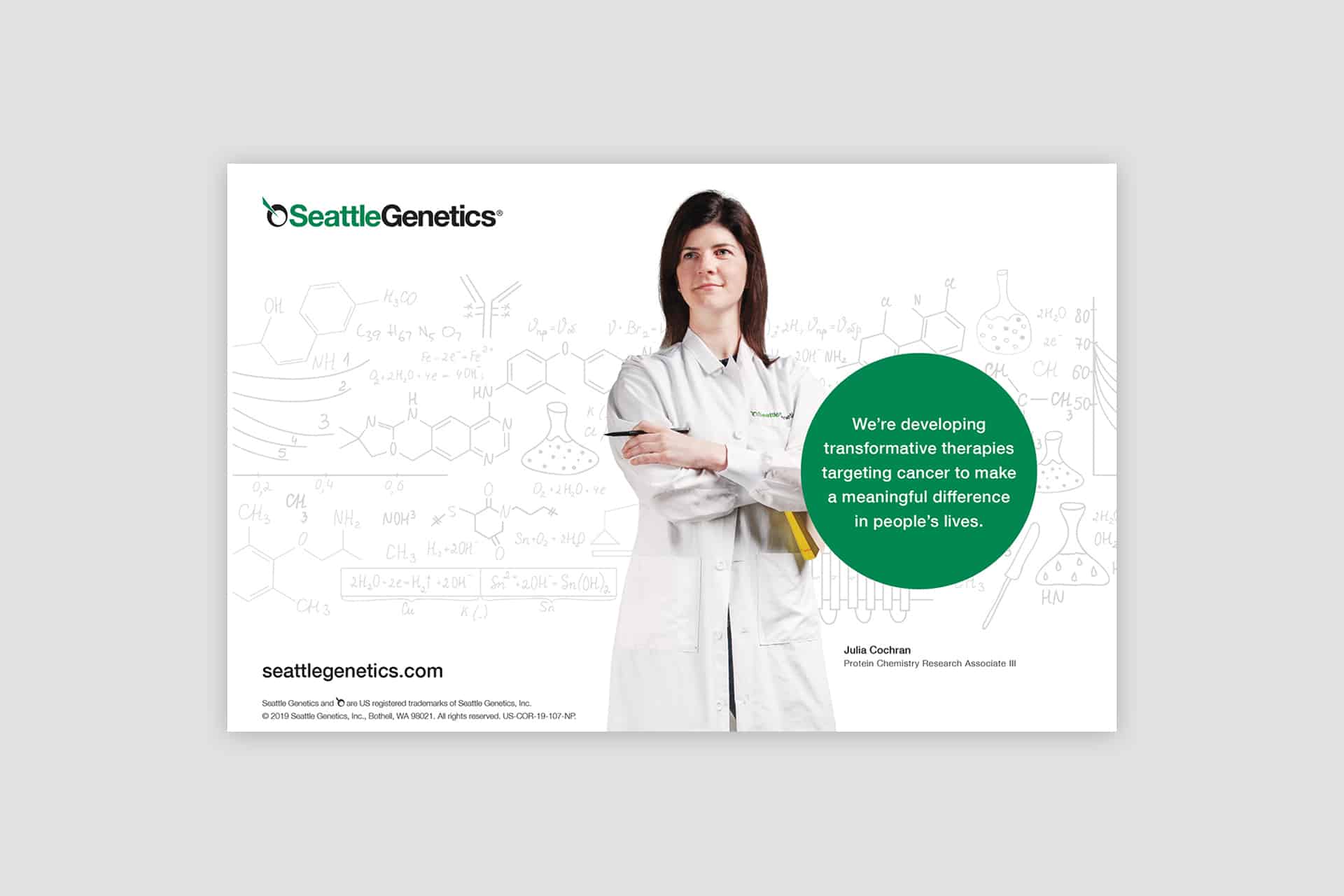
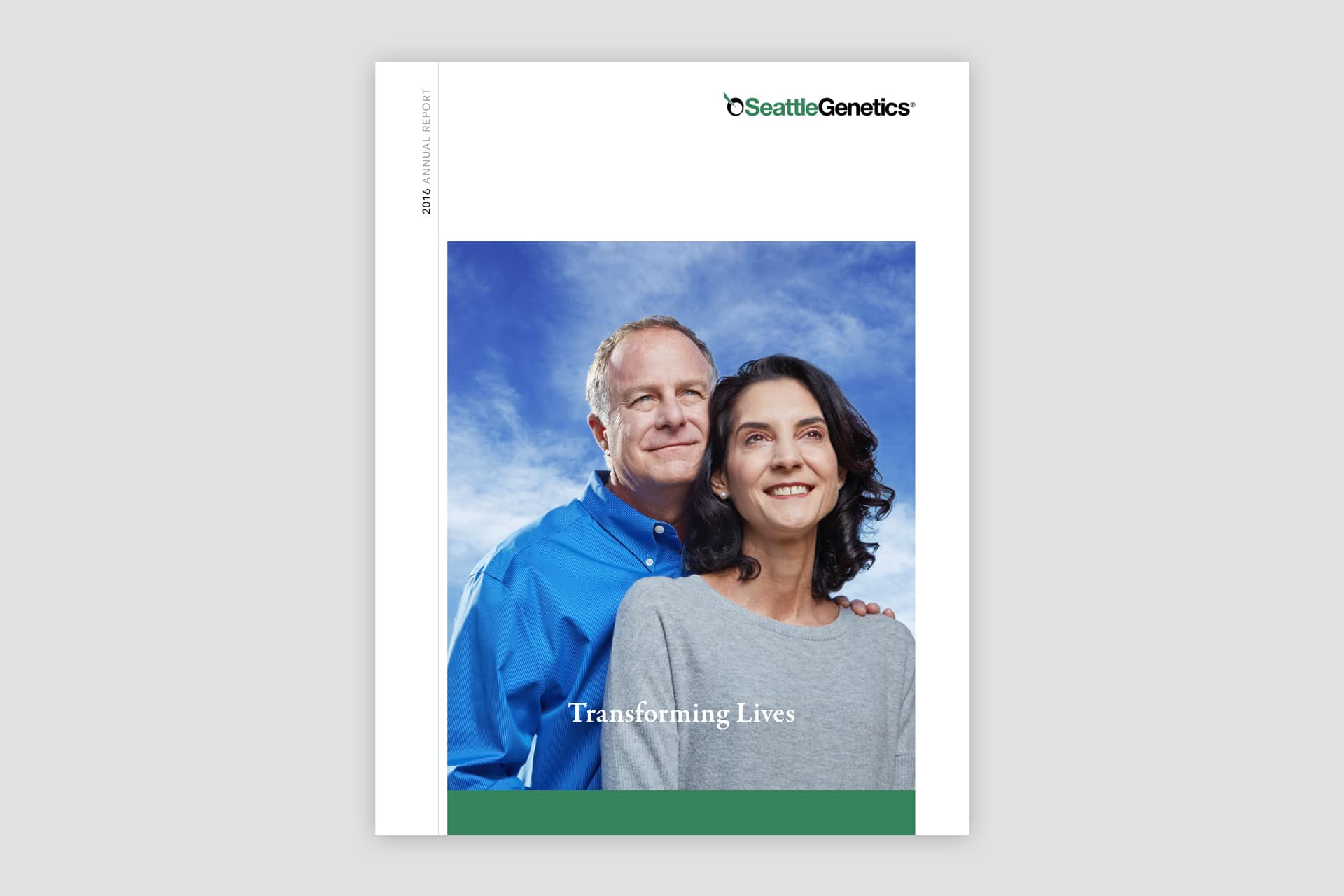
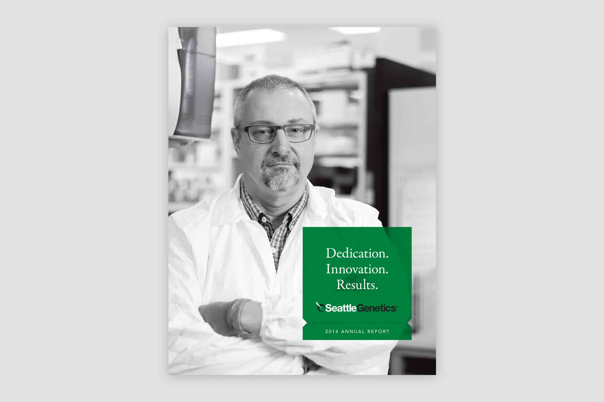
In addition to brand design and implementation, we created a library of custom photography to use in all of the communications materials. The photos included lab shots, lifestyle shots and portraiture. All photography shown below were taken by Graphica on location at Seagen.