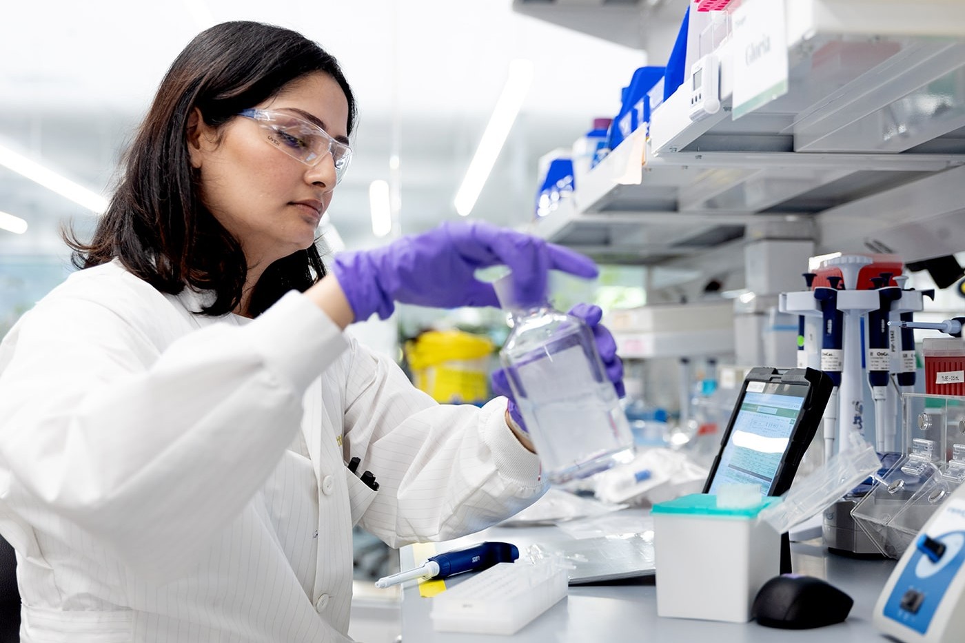
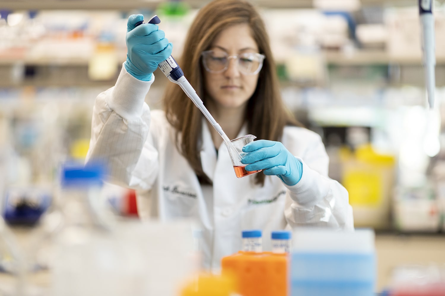
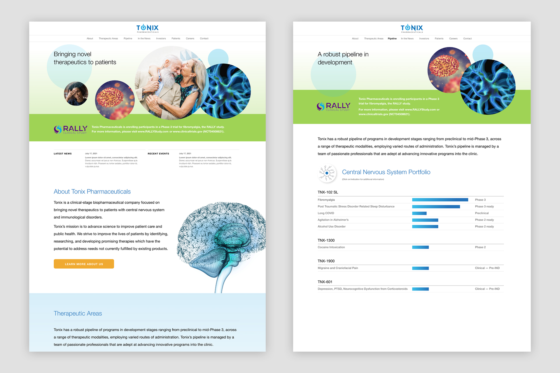
Tonix is a New Jersey-based biopharmaceutical company focused on developing novel therapeutics to prevent and treat central nervous system disorders, immunology conditions, infectious diseases, and rare diseases.
Client
Tonix Pharmaceuticals
Year
2022
Services
Brochures
Logo Design
PowerPoint Templates
Trade Show Booth Graphics
Website Design & Builds
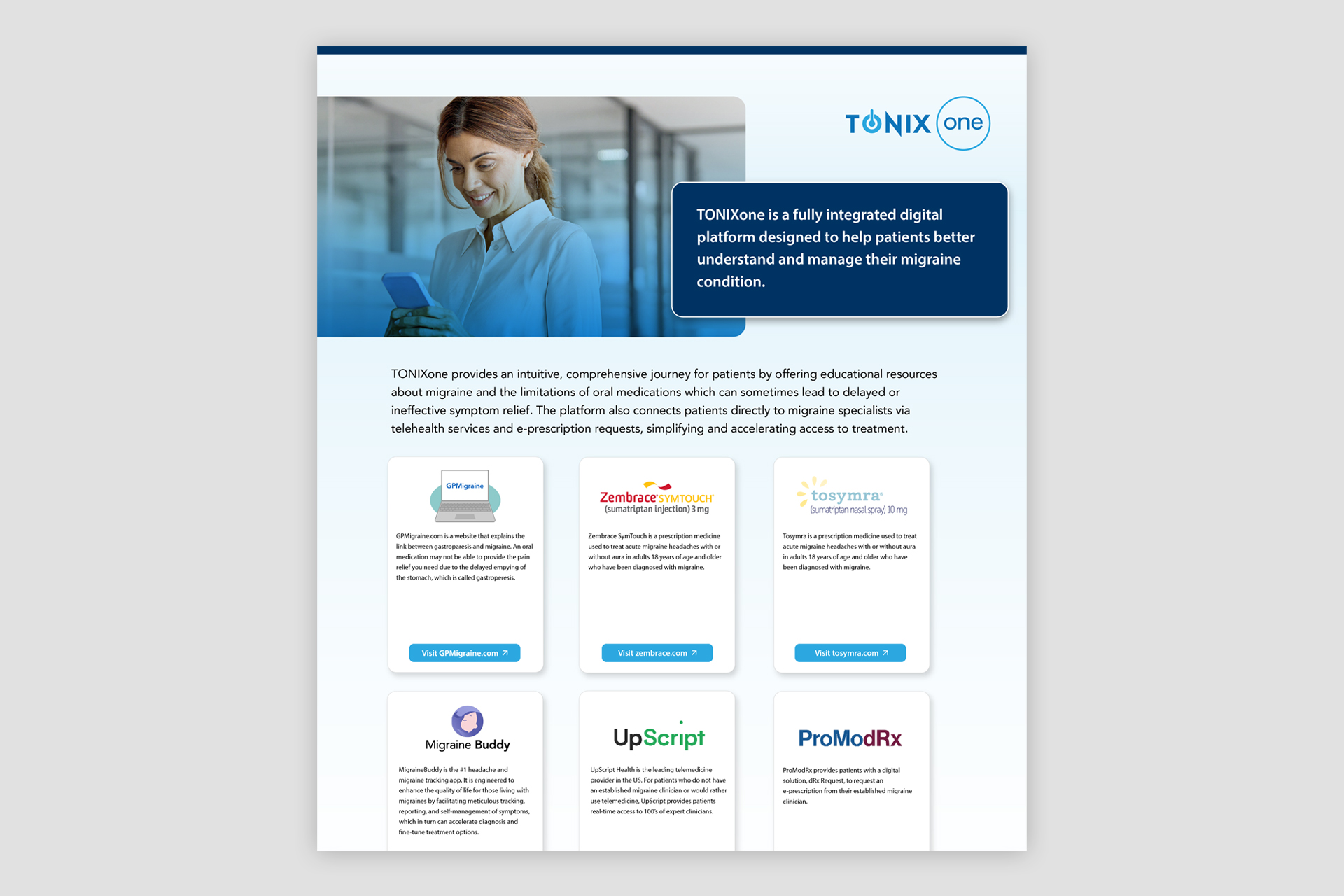
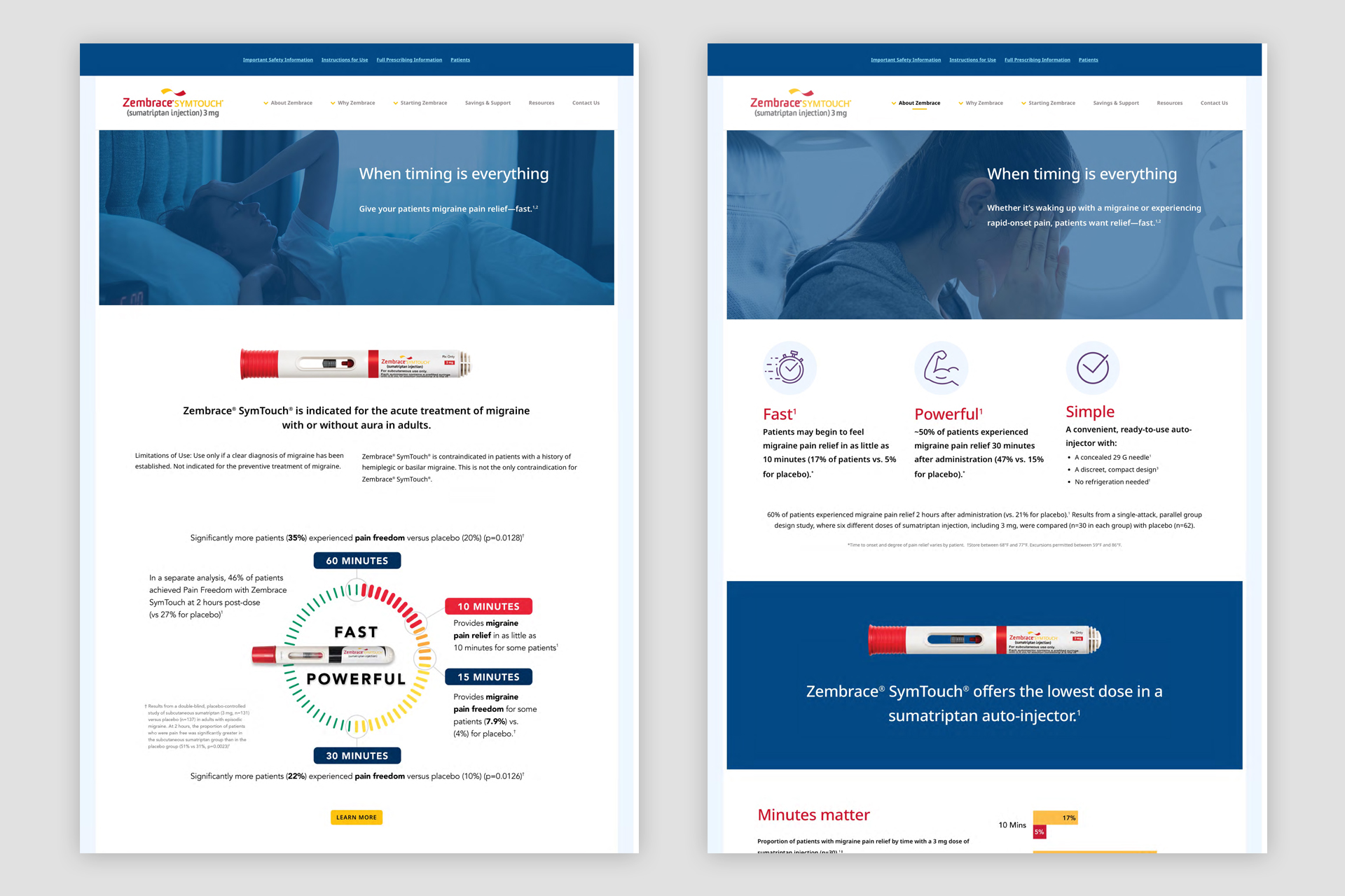
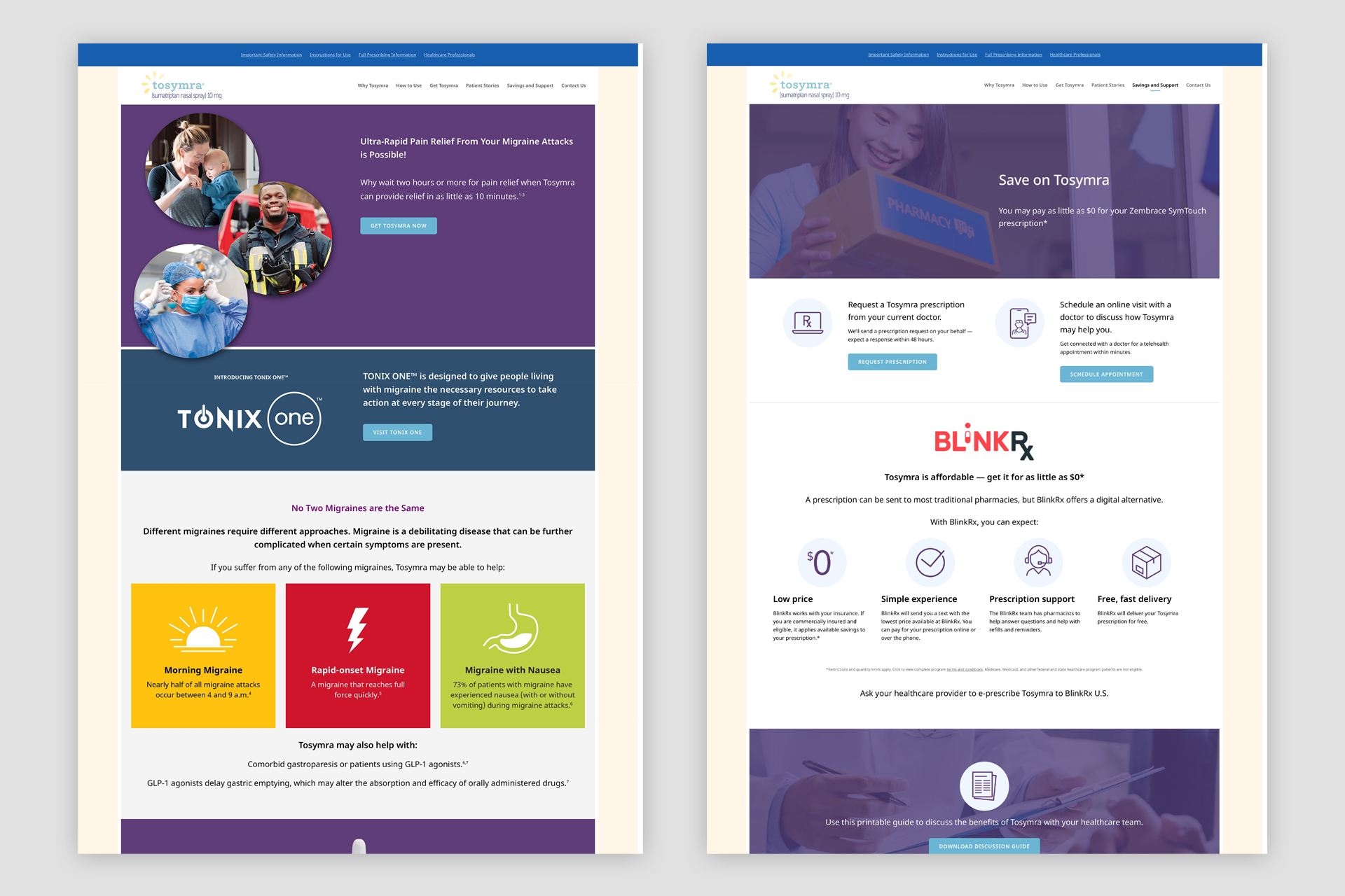
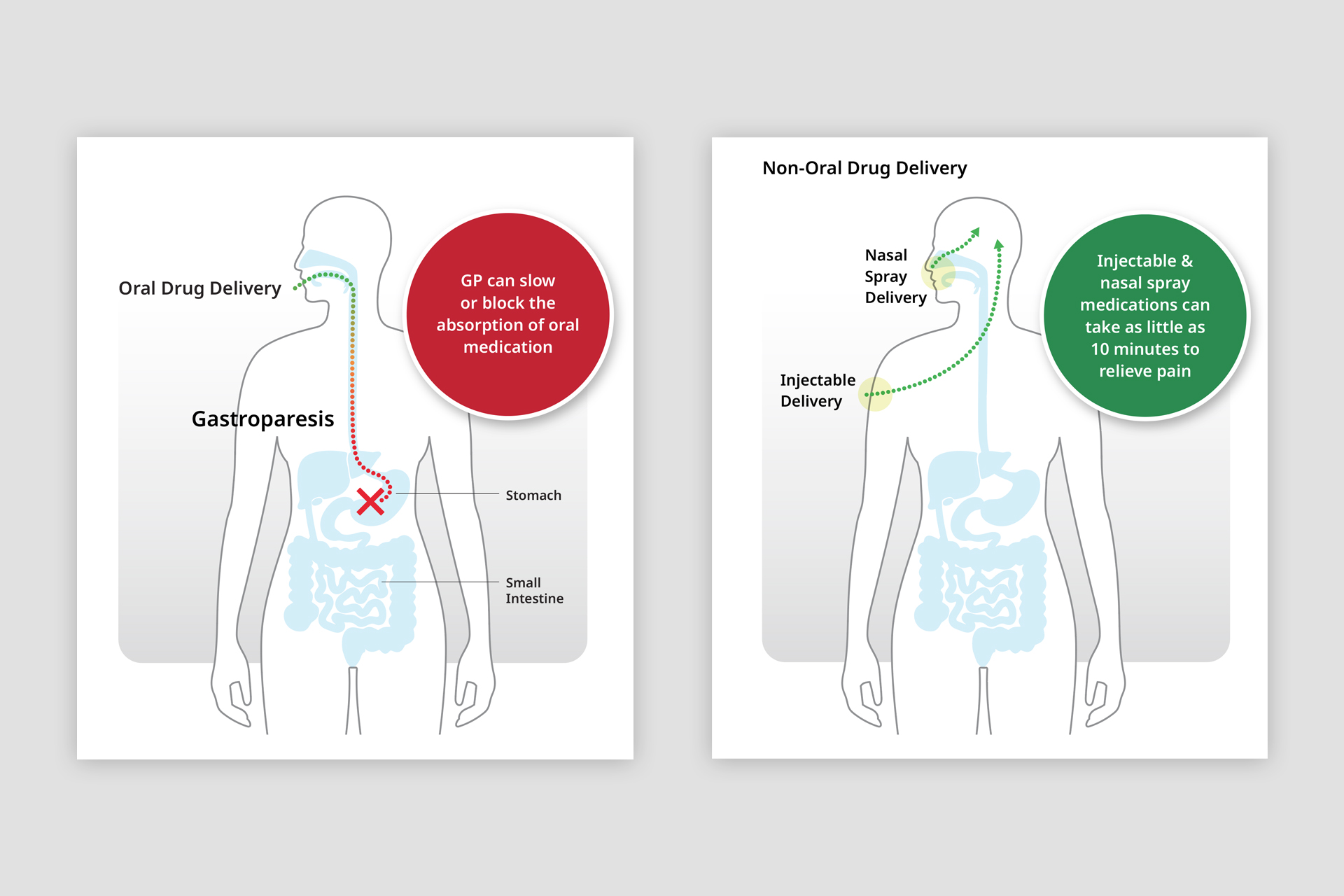
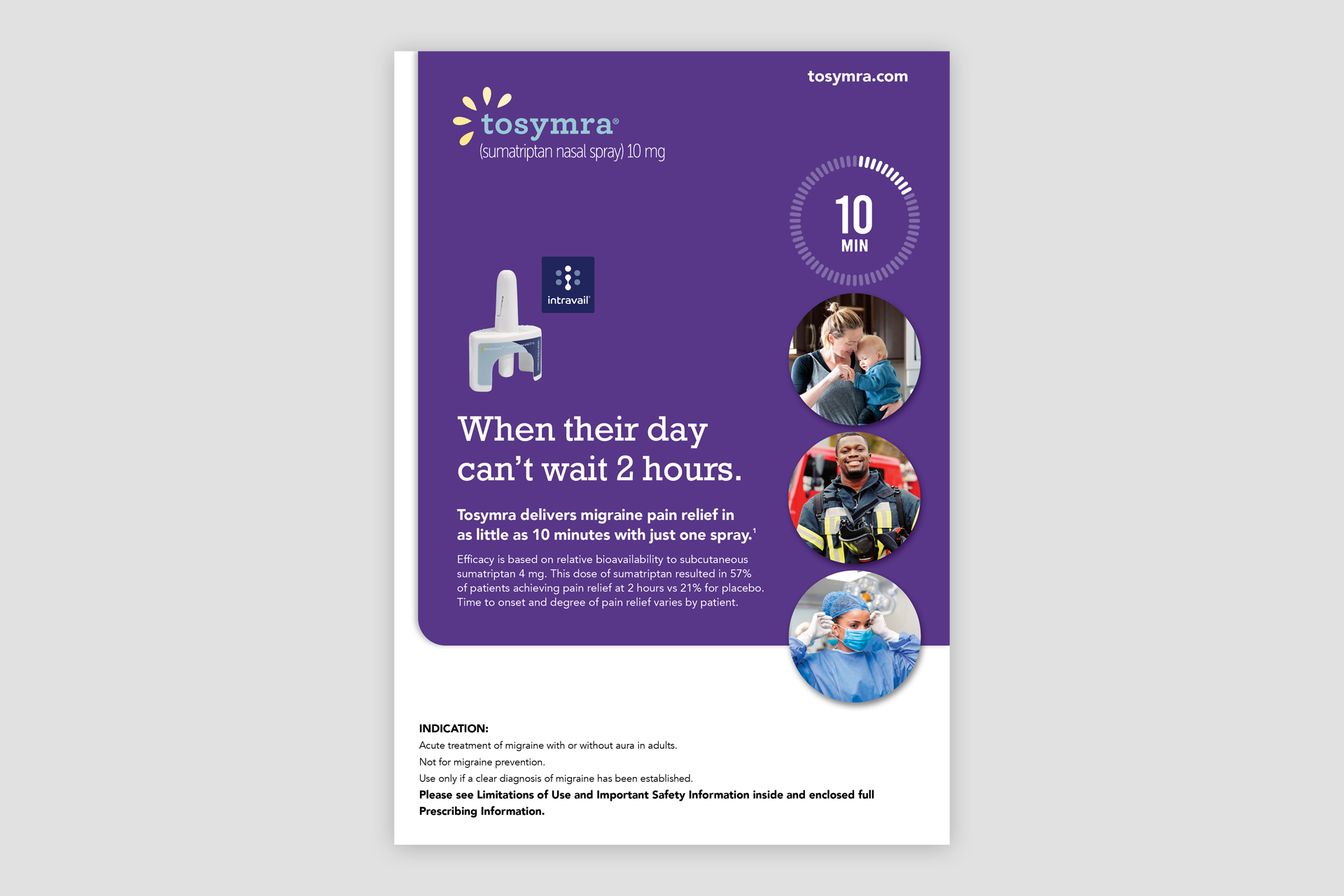
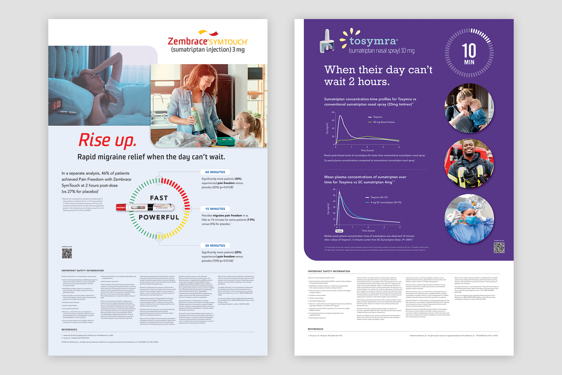
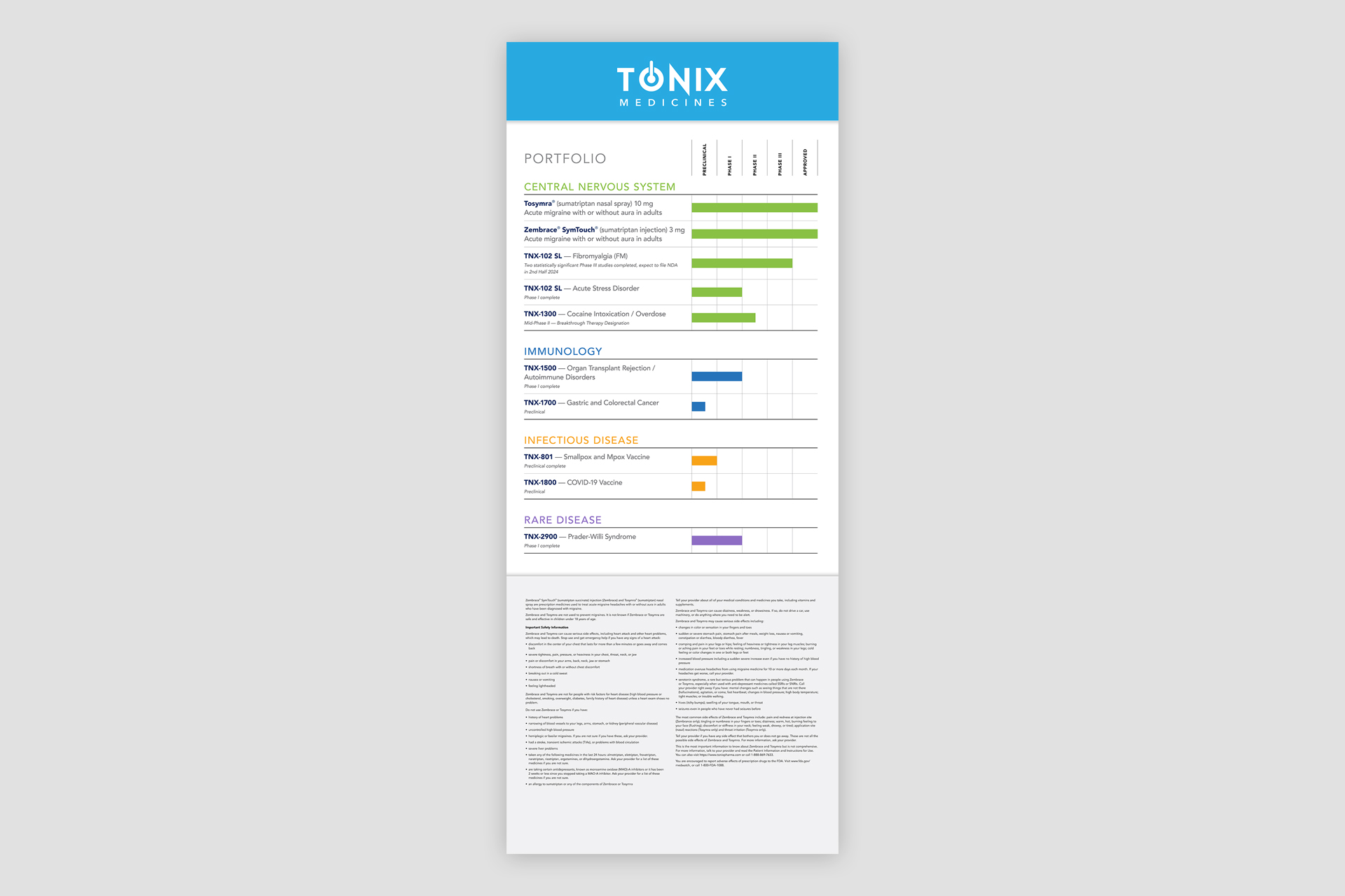
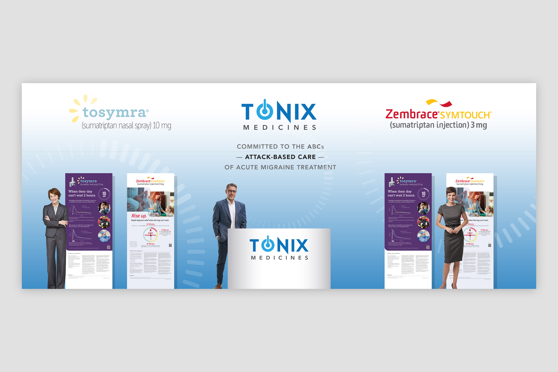
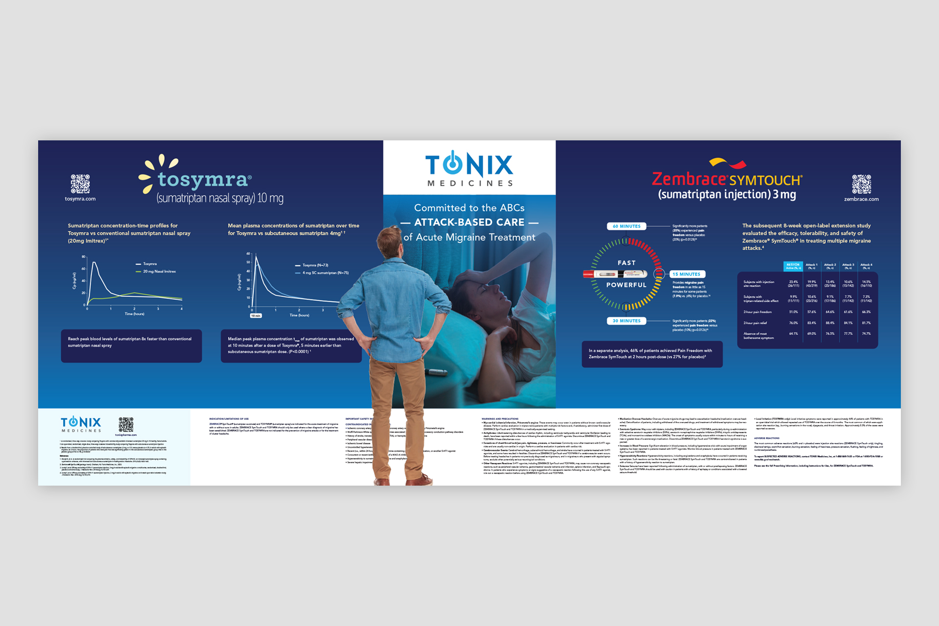
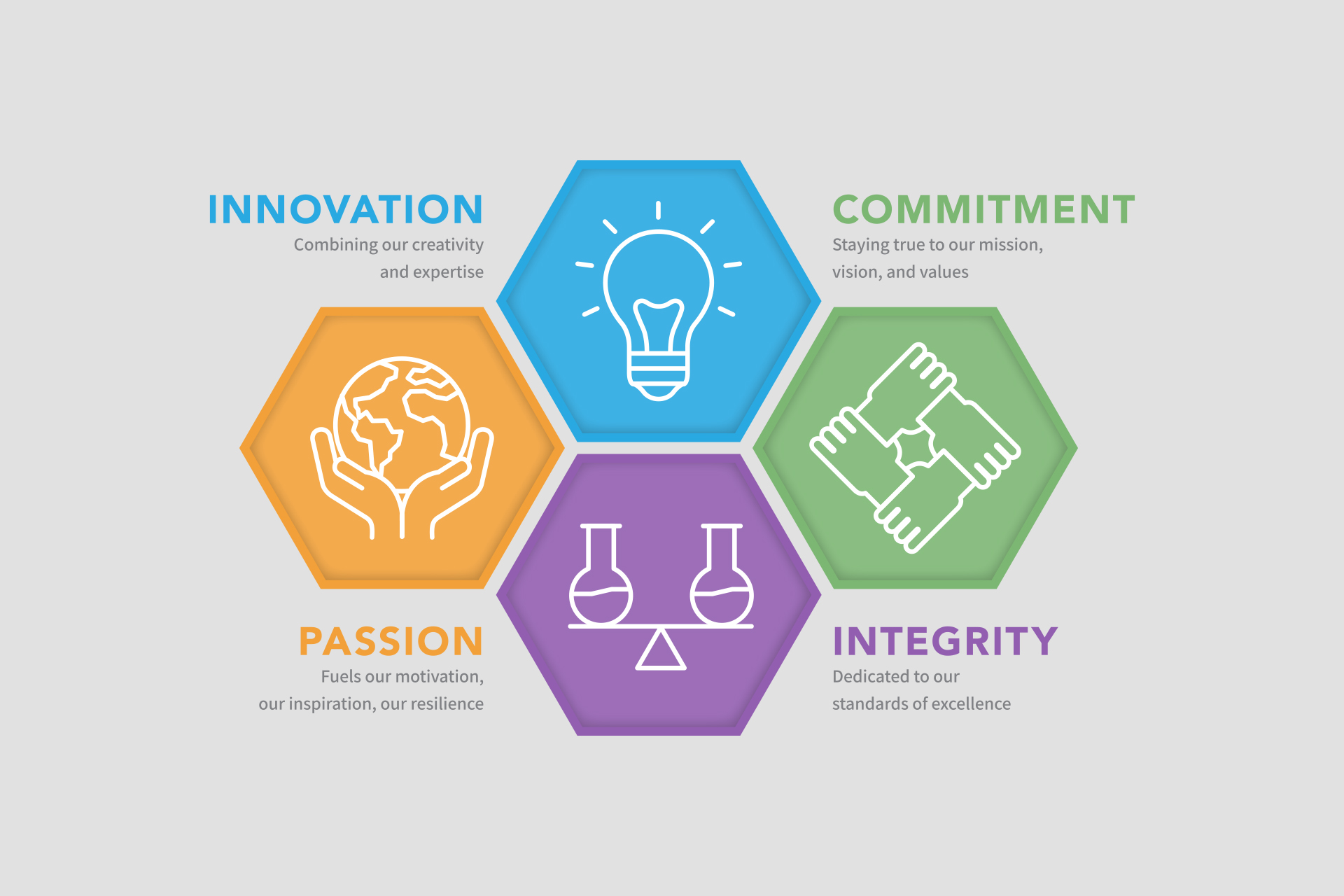
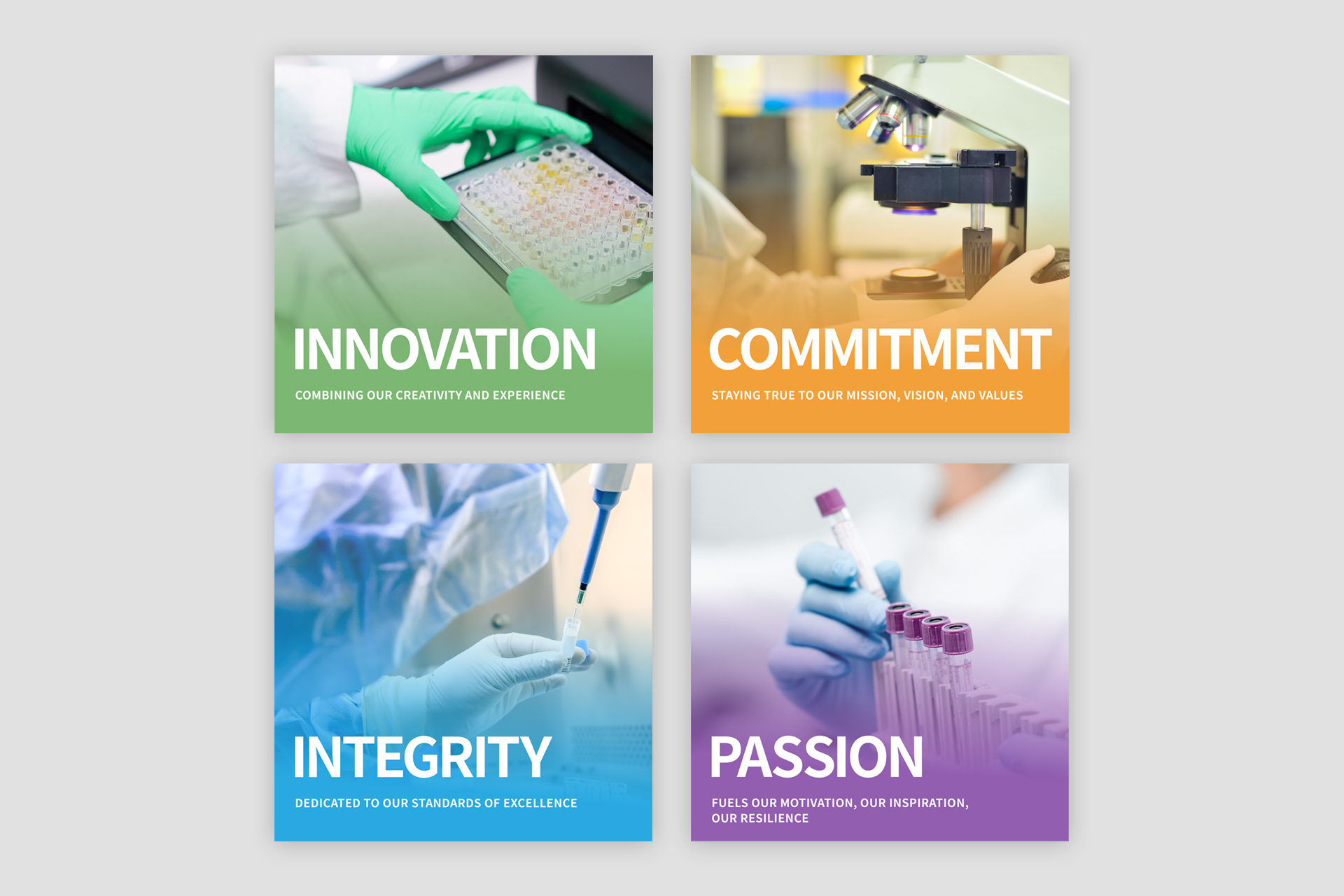
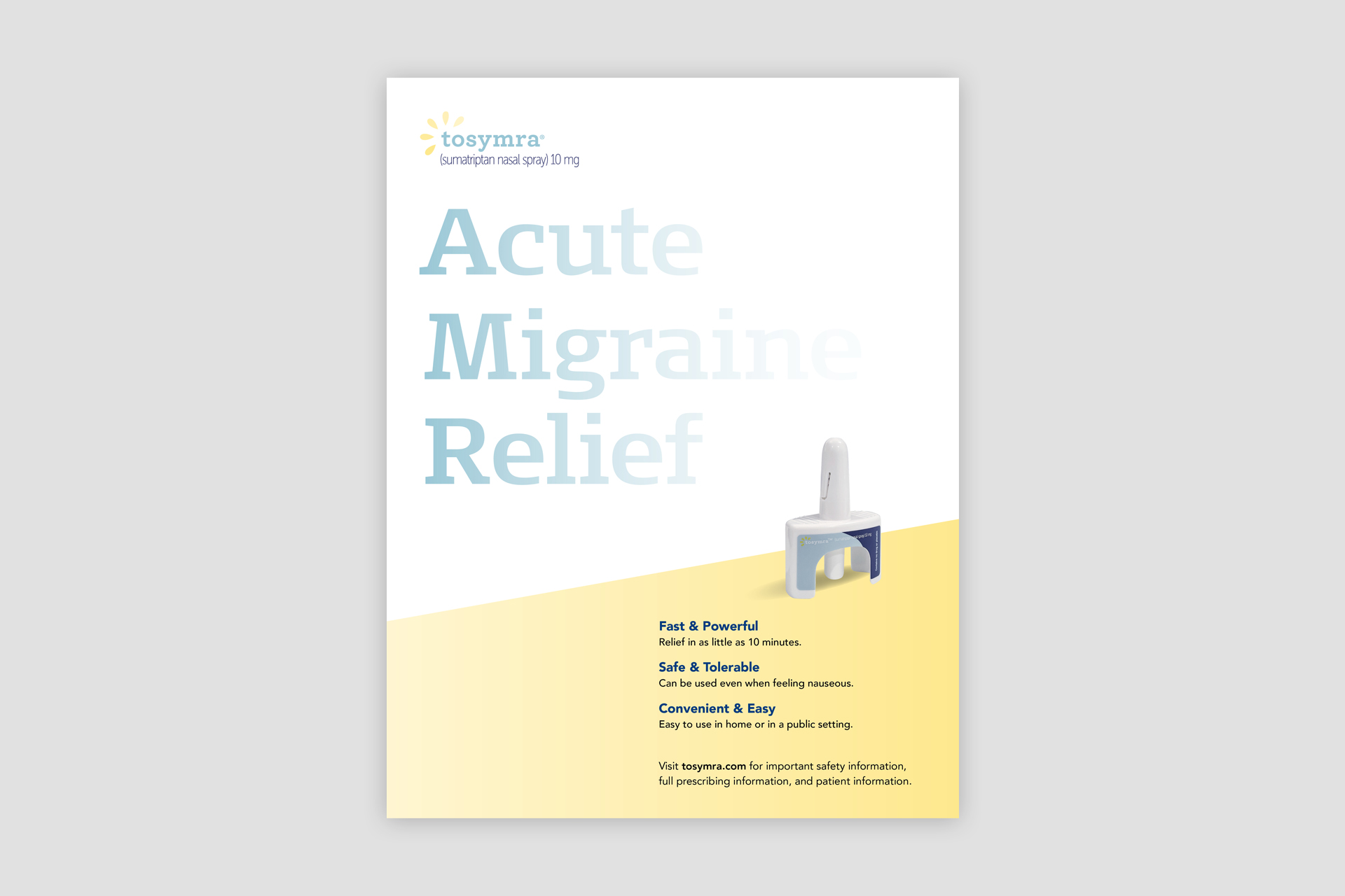
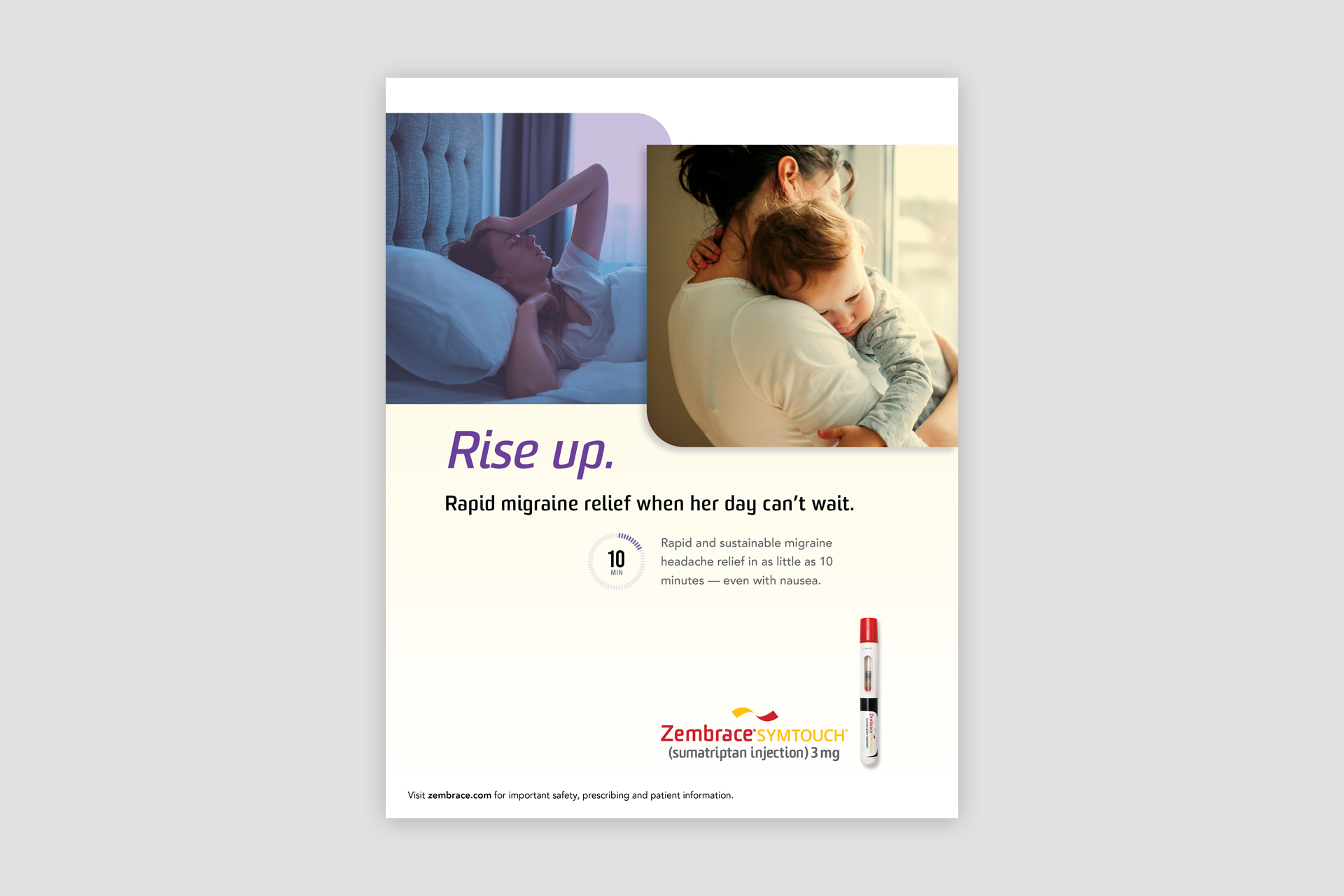
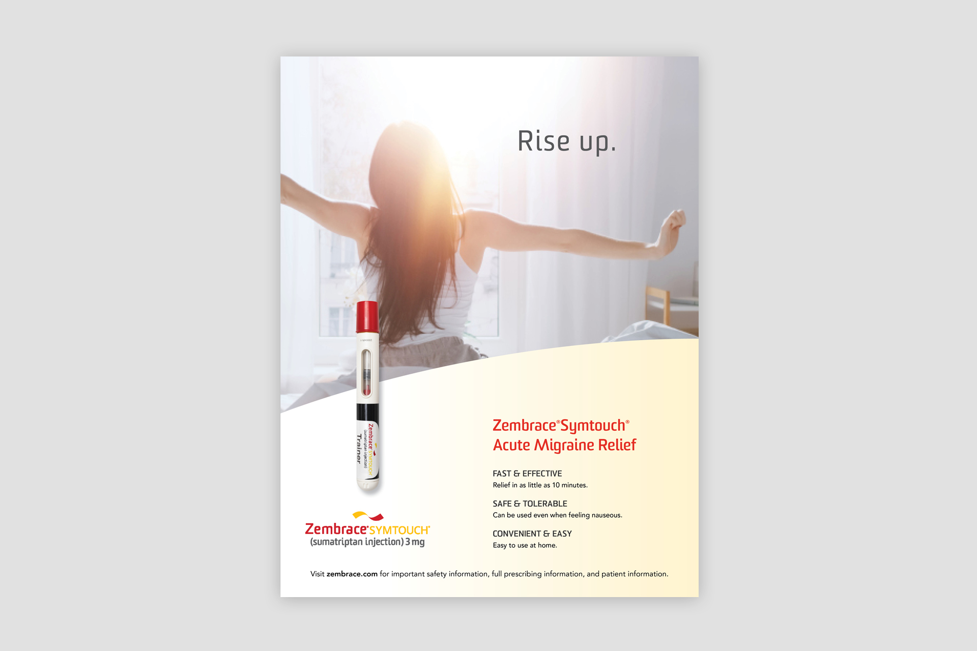
Multi-tiered support.
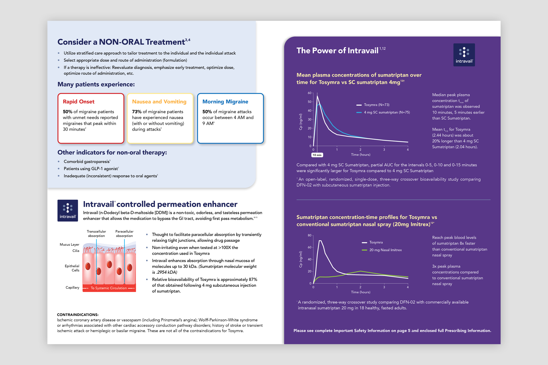
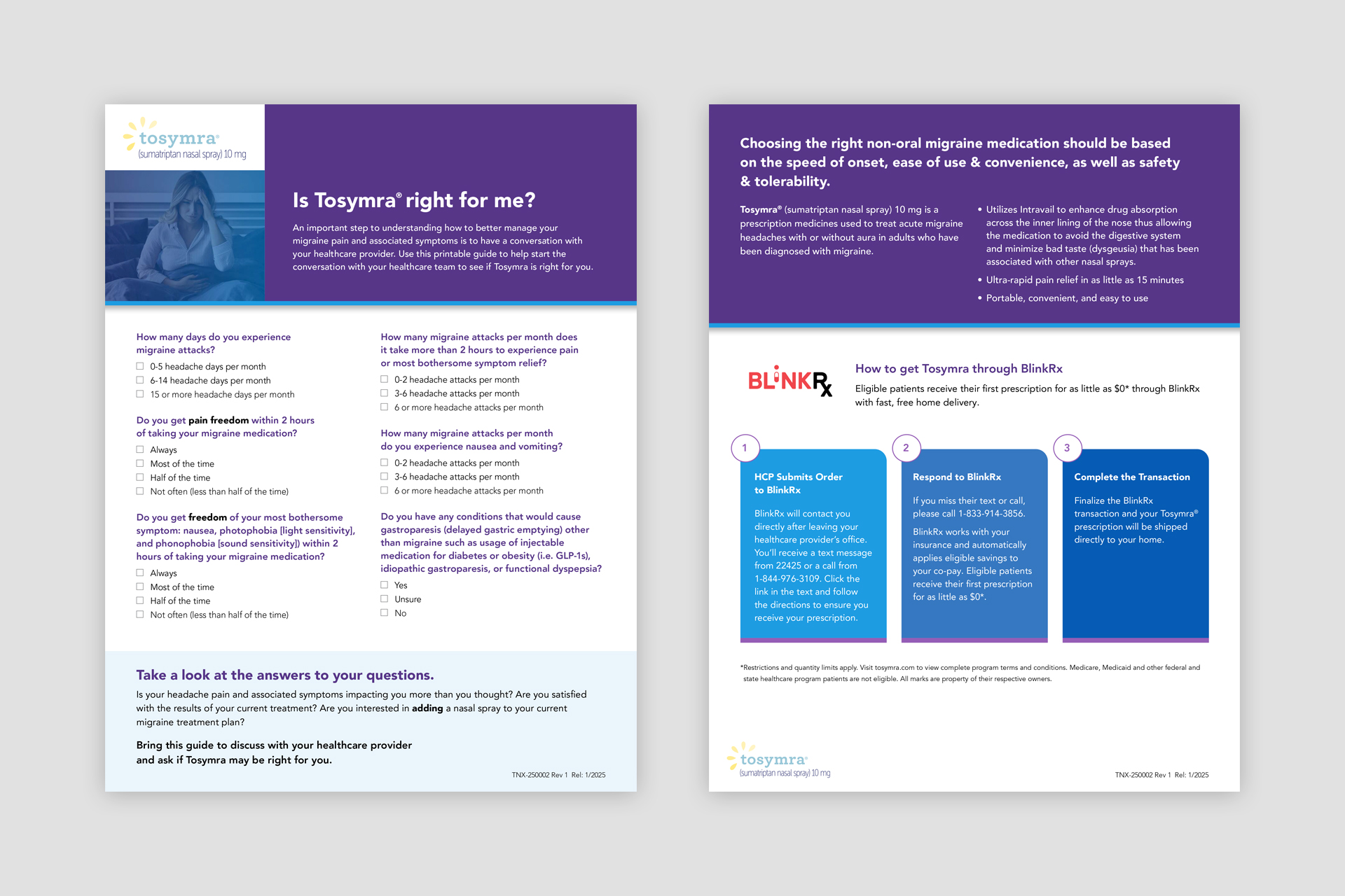
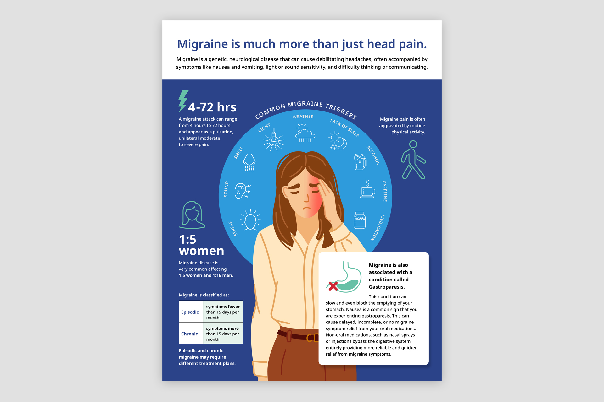
Graphica supports both the corporate office and the medicines division. We have developed websites for their migraine products, handout materials for healthcare providers and potential patients, and trade show exhibits. We also created the logo and website for their online platform, TONIX ONE, designed to help patients with resources and access options for their medications.
Pantone® 532 C
C71 M65 Y64 K72
#232323
Pantone® 128 C
C3 M14 Y76 K0
#f9d55c
Pantone® 663 C
C02 M01 Y01 K00
#f7f7f7
Pantone® 663 C
C02 M01 Y01 K00
#f7f7f7
Research
The mission for the corporate office was to present itself as a dynamic pharmaceutical development company with deep scientific knowledge. For the medicines company, Tonix wants to obtain more marketshare in the migraine medicine market. To achieve this, we needed to do a deep dive on the competition and present Tonix in a way makes them standout on the crowded marketplace.
Strategy
Other companies have celebrity spokespeople, which is very expensive. The key differentiator for Tonix is time. Their medication is able to provide relief faster than the competition so that’s the message we embraced and developed.
Creative Direction
We built on Seagen’s existing brand equity to signal an evolution rather than a reinvention of the company. The core premise of the logo remained intact, while thoughtful refinements gave it greater presence and impact. Supporting brand elements were refined and expanded to create a more cohesive, consistent system that maintained flexibility across applications.
Design
The design language was built around clear and concise communication. The type was crisp and approachable. The color palette was eye catching and flexible. The consistent structuring of the graphic elements created consistency throughout the organization. Supporting program and department logos were designed as a cohesive system.
Implementation
Due to the size of the company and number of departments, we decided to tackle the projects in phases. The most mission critical business communications were first — website, investor materials, business cards and email signatures, building signage, Zoom meeting backgrounds, and social media graphics. Changing to the new brand on the remaining items was addresses on an as needed basis.
Results
The brand evolution resulted in a cohesive and adaptable system designed to balance departmental differentiation with a unified brand experience. The refreshed identity brought a crisp, modern presence to Seagen, strengthening its distinction within the competitive landscape. Detailed brand guidelines empowered employees with practical tools and clear direction to create materials that maintained consistency while meeting the unique needs of their teams.
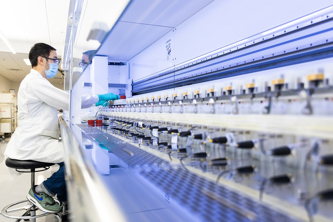
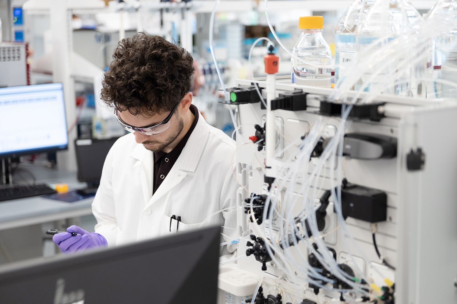
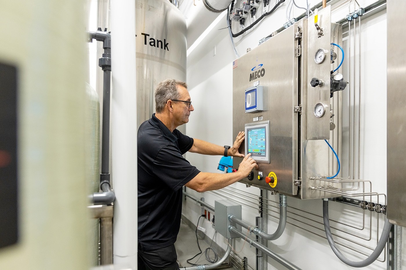
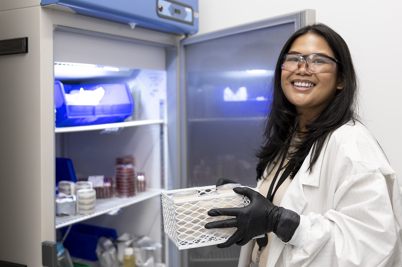
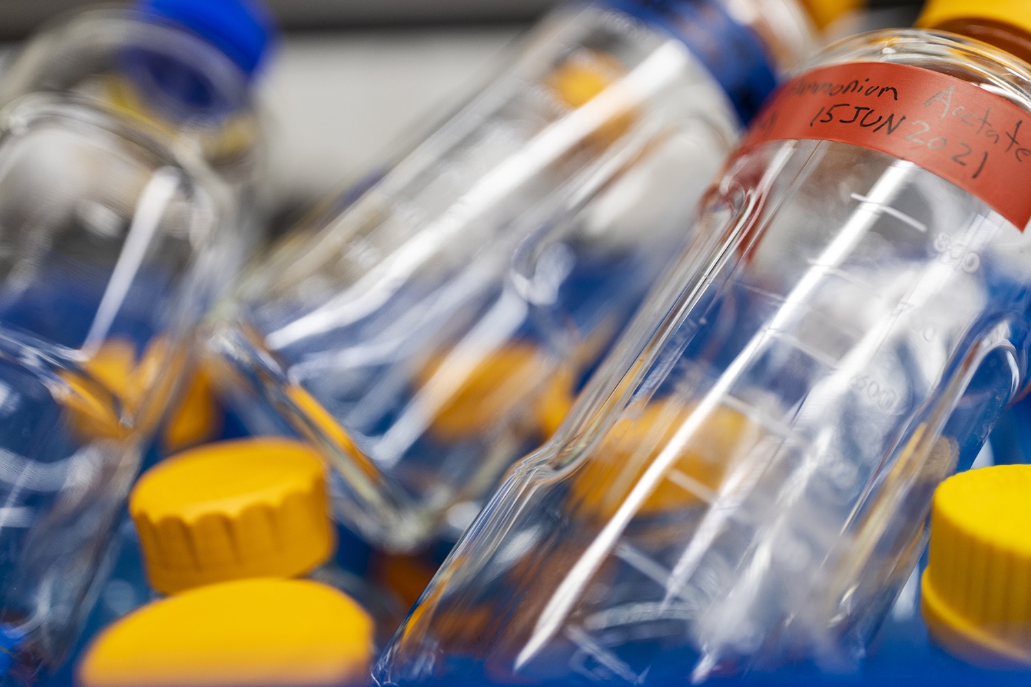
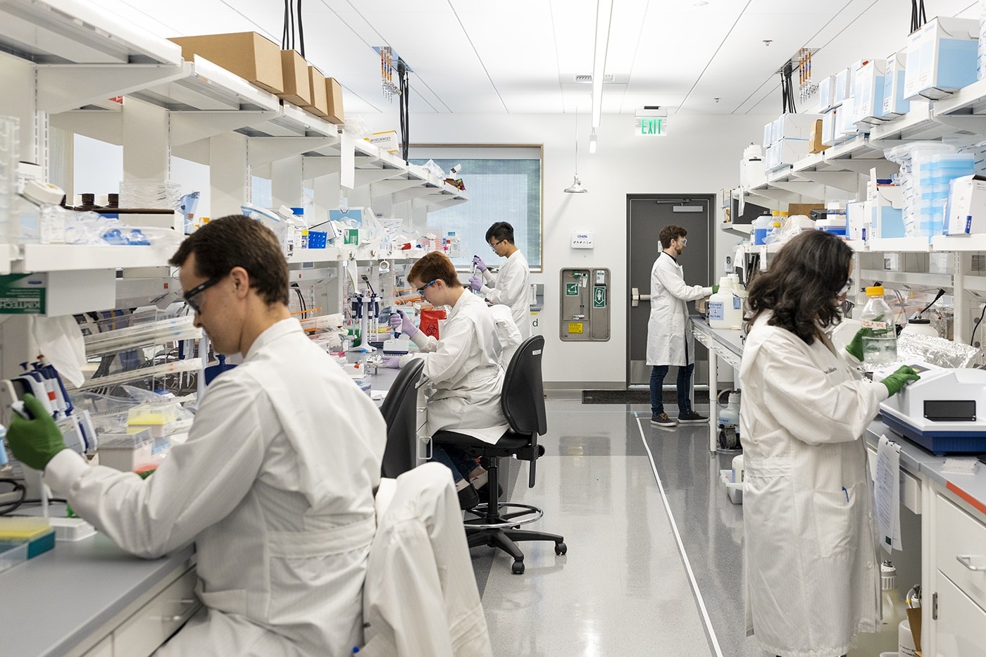
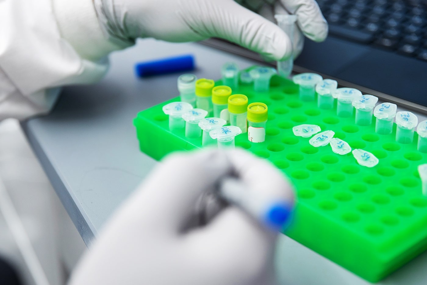
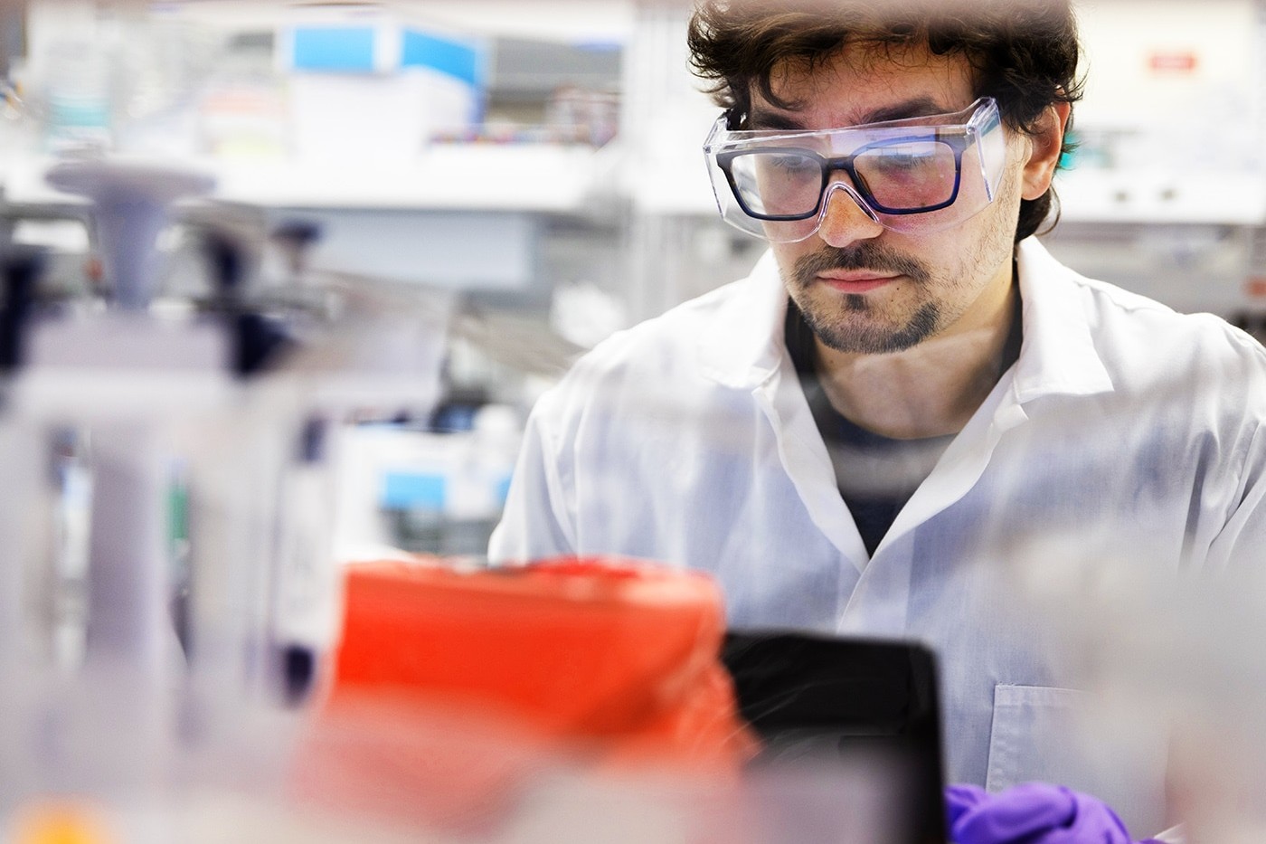
Custom photography
In addition to brand design and implementation, we created a library of custom photography to use in all of the communications materials. The photos included lab shots, lifestyle shots and portraiture. All photography shown below were taken by Graphica on location at Seagen.